One Click Zoom IN / OUT on the Map
Long time no write : )
The other day, I uploaded the Video-clip of one-click zoom in / out.
There were unexpectedly lots of replies over weekend that includes the requests to explain the steps.
After lots of trials and errors, finally achieved one-click State zoom in& out actions... ワンクリックズームイン&アウトようやく分かった。 #tableau #タブロー pic.twitter.com/tF460SC6fk
— Shinichiro Murakami (@smurakam0201) October 6, 2018
Actually this is more wanted, I believe.
#tableau #タブロー I got lots of replies on one-click zoom in/out. I think this is more wanted version. Also I am now preparing the blog post to explain the steps. pic.twitter.com/ONcRqpuj19
— Shinichiro Murakami (@smurakam0201) October 8, 2018
Here is steps.
I used two main technicques.
1. Union and Dual Axis
2. Action with Taget
== Create Union and Dual Axis ==
1.1 Create Union.

1.2 Create Dual Axis
And what we want to do is swap these maps.
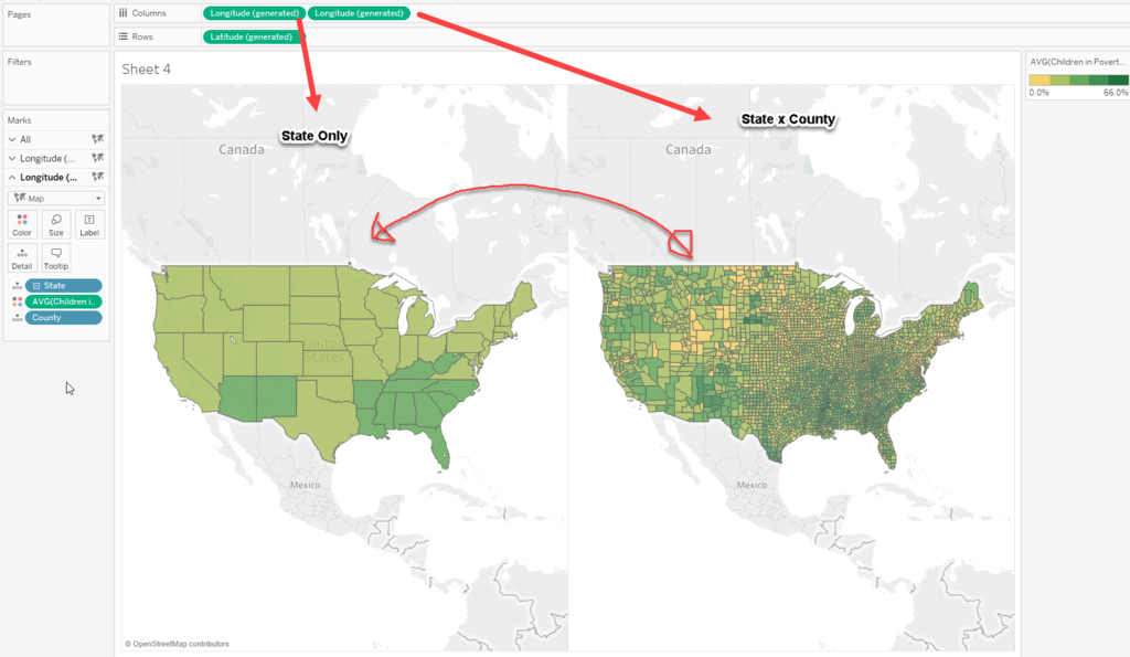
1.3 Now we have "Table name" from Union feature which brings 2 x 2 charts.
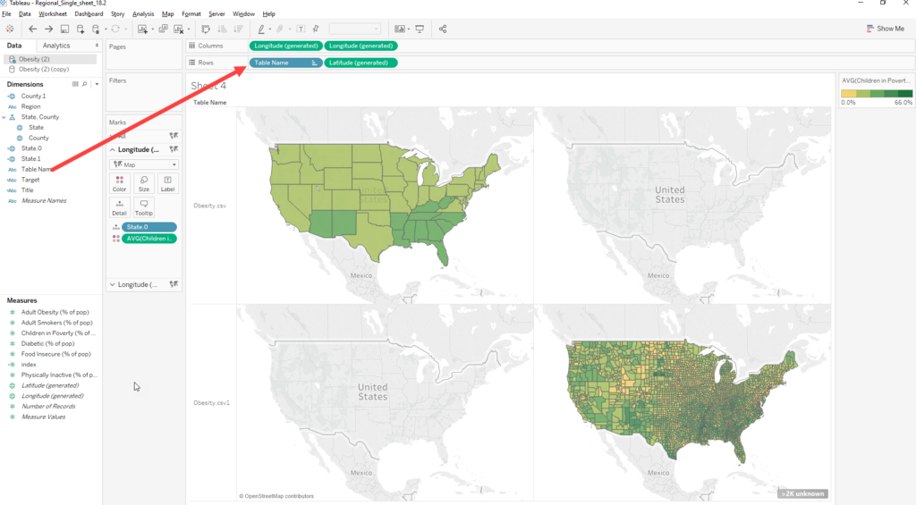
1.4 Create conditional Calc Fields.
State.0
if [Table Name]="Obesity.csv" then [State] end
State.1
if [Table Name]="Obesity.csv1" then [State] end
County.1
if [Table Name]="Obesity.csv1" then [County] end
** Don't forget to assign geo role for respective fields. ***
1.5 Put "State.0" into primary Axis and "State.1" and "County.1" into Secondary Axis instead of "State" and "County".
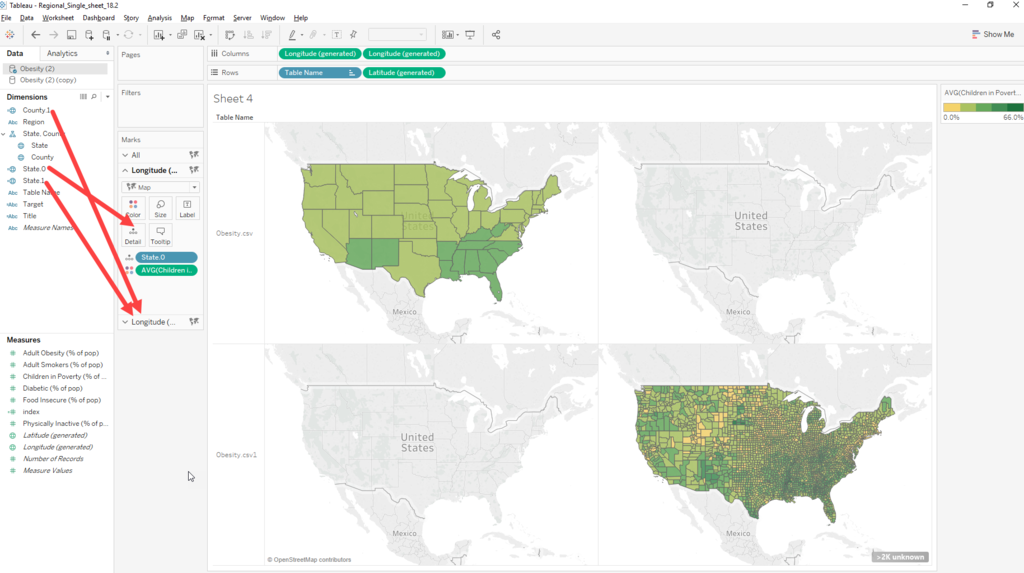
1.5 Set Dual Axis.

== Action With Target ==
The question is how to make "Trigger" to swap Two "Tables" (Top and Bottom)
2.1 Create another Calc Field.
Target
if [Table Name]="Obesity.csv" then "Obesity.csv1"
elseif [Table Name]="Obesity.csv1" then "Obesity.csv"
end
2.2 Put Target into Detail.
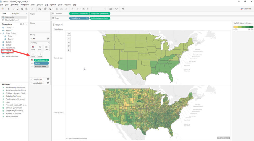
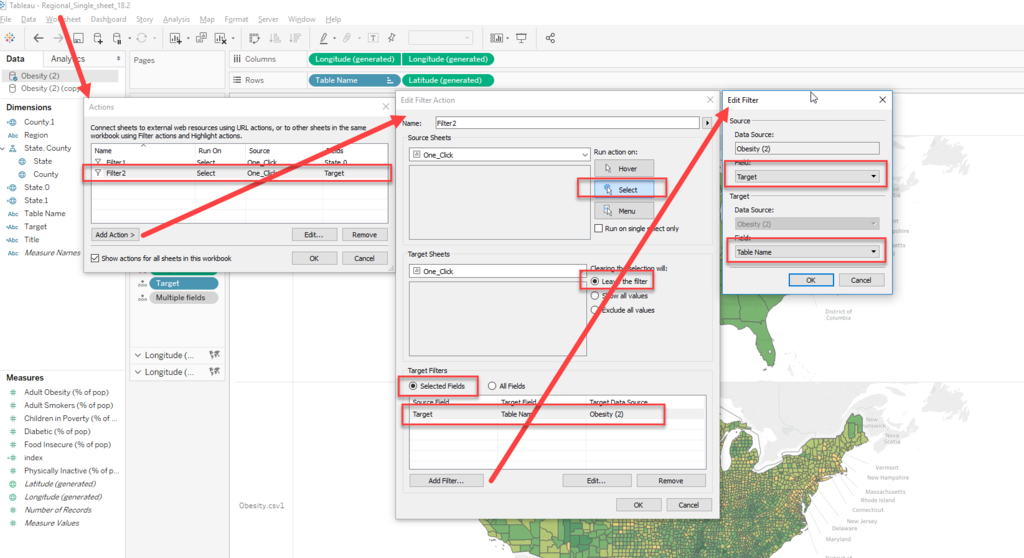
2.3 Create two Actions.
2.3.1 "State.0" to :State1."
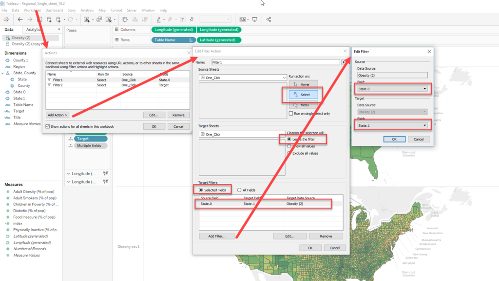
2.3.2 "Target to Table Name"
**** This is a key to kick the trigger of swapping two Tables.
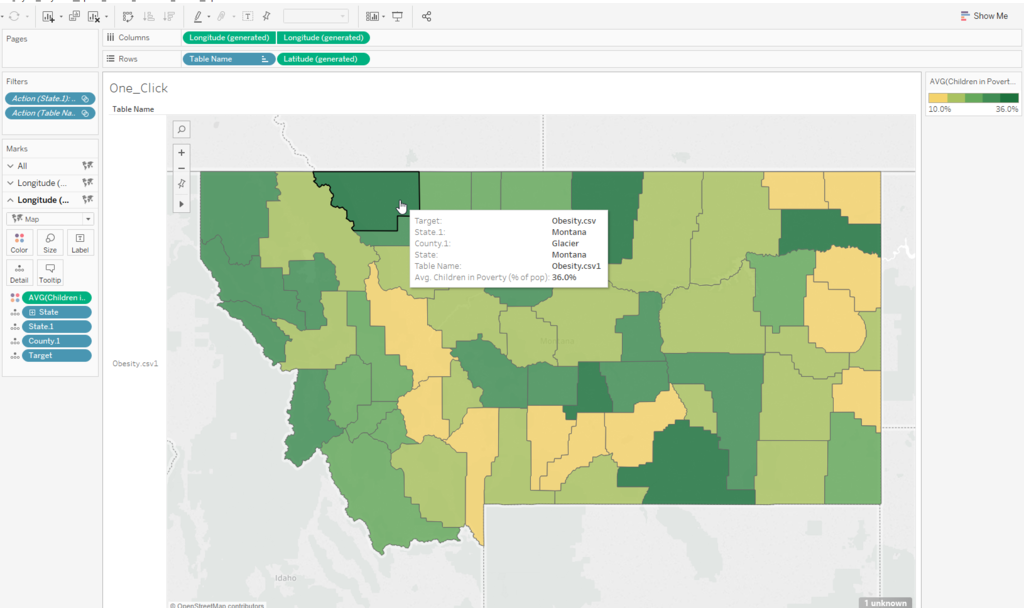
Click any "State" on Top map

Brings another table name which has County detail in it.

And another click on any County.
Table is alternated.
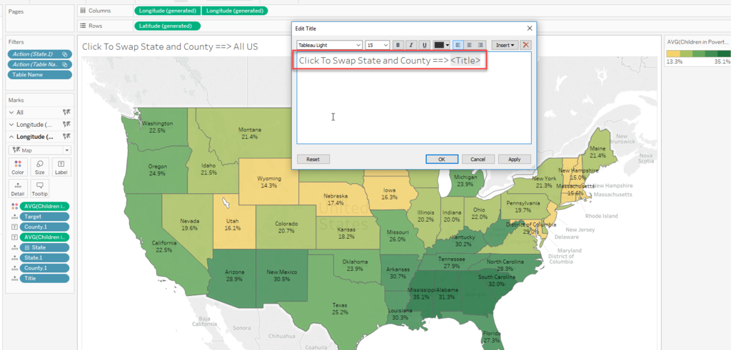
Clean up the title and Label.
Title
if [Table Name]= "Obesity.csv" then "All US" else [State] end
#tableau #タブロー I got lots of replies on one-click zoom in/out. I think this is more wanted version. Also I am now preparing the blog post to explain the steps. pic.twitter.com/ONcRqpuj19
— Shinichiro Murakami (@smurakam0201) October 8, 2018
Add Comment if you have any questions.
Enjoy Tableau !!

Example of Water Fall Charts - 2
I wrote Water Fall Chart example yesterday.
It became very long post.
But actually here is much simpler way to create a Water Fall Charts.
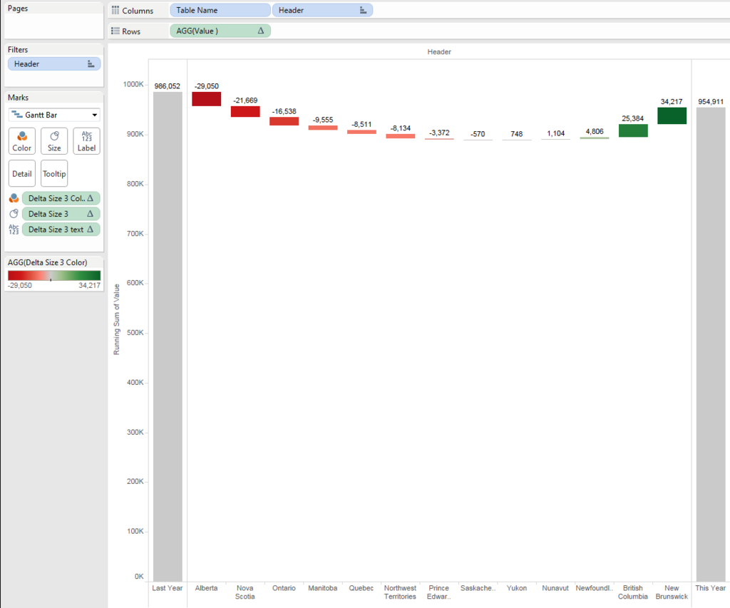
Using this way, we can create a chart on one worksheet, no need to create dashboard to combine three charts.
This is the huge benefit.
However, we need to use "Union" to triple the data, which is sometimes not available because
- Union is only available version 9.3 or newer
- Some data connection types does not allow to us Union
- Union might cause the performance issue because of tripled data
In other words, as long as the above conditions ares not concerns, you can enjoy much simpler solution.
OK, let's start with Union.
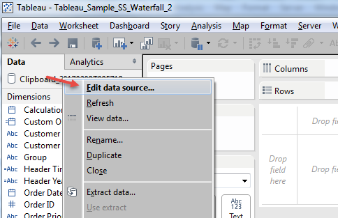
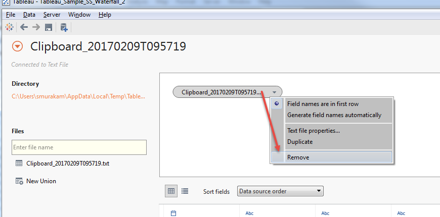

Now we have new field "Table Name".
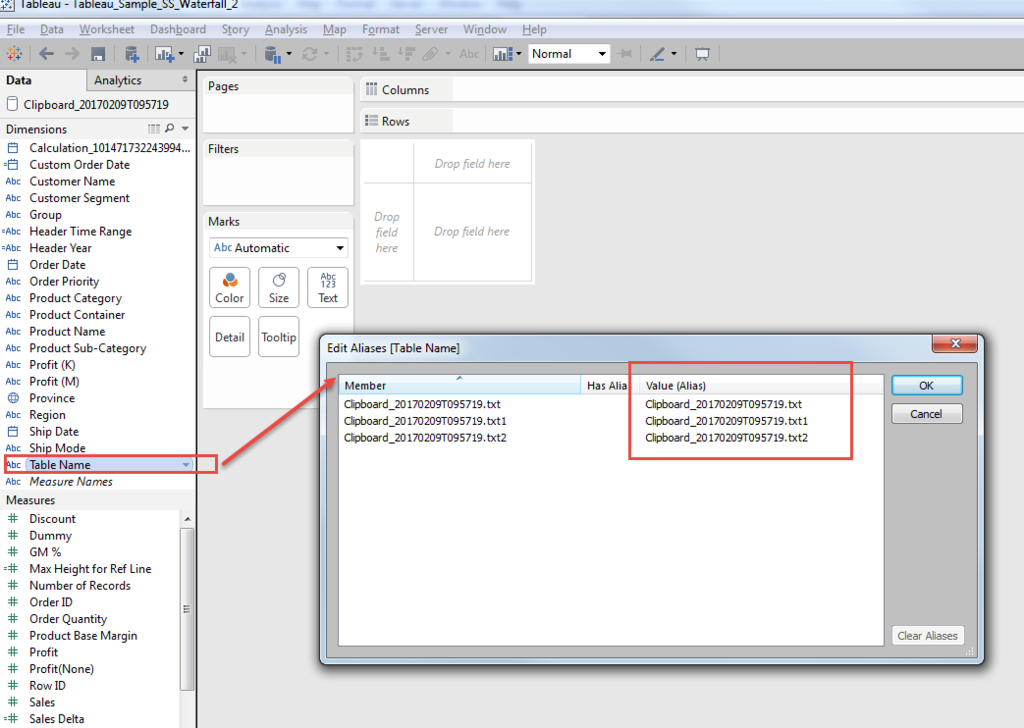
Then we can use "Table Name" as additional dimensions which make us easy to control both header and measures.
Let me explain.
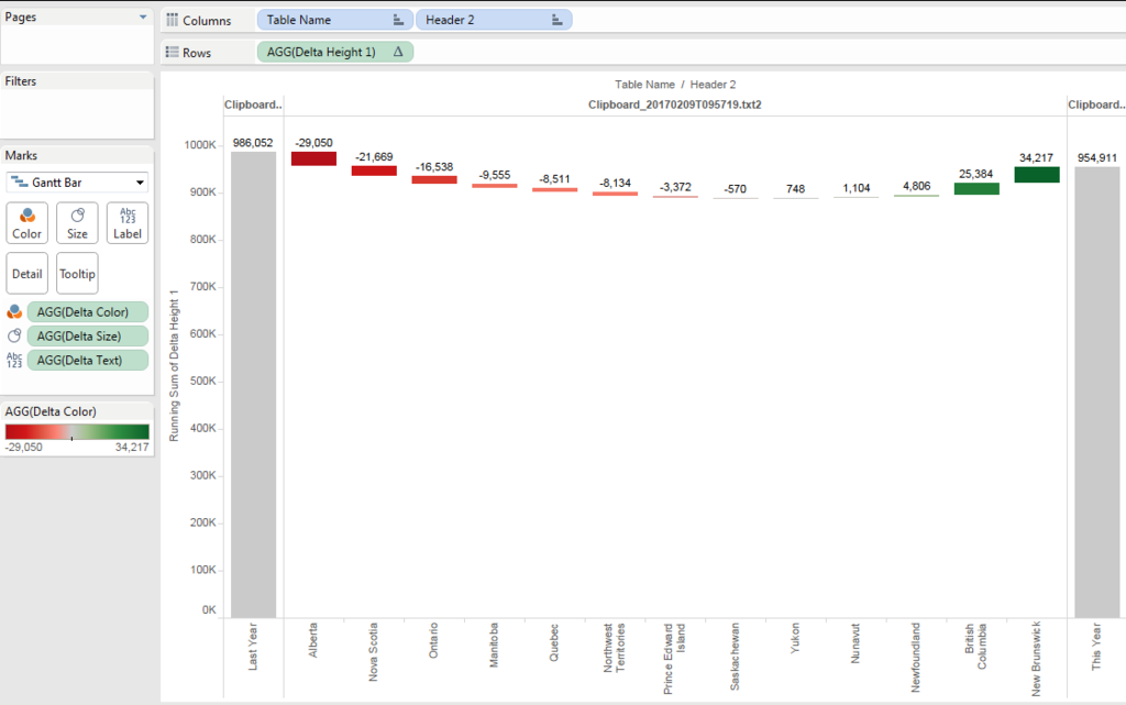
The initial difficulty of water fall chart was how to conbine "Last Year" and "This Year" as bucket sum, and "Delta" as break-down to Province.
With having additional dimension, we can control this.
[Header 2]
if [Table Name]="Clipboard_20170209T095719.txt" then "Last Year"
elseif [Table Name]="Clipboard_20170209T095719.txt1" then "This Year"
else [Province] end
Talking about measusres, one important consideration is needed with this approach.
Because we tripled all the ata with Union, to get corect numbers, we always take care to avoid data duplication.
In case of LOD, we need to specify the [Table Name].
[Sales Last year]
{fixed [Table Name]:sum(if [Header Time Range] ="Last Year 3 months" then [Sales] else 0 end)}
[Sales This year]
{fixed[Table Name]:sum(if [Header Time Range] ="Curent 3 months" then [Sales] else 0 end)}
[Sales Delta]
sum(if [Header Time Range] ="Curent 3 months" then [Sales] else 0 end)-
sum(if [Header Time Range] ="Last Year 3 months" then [Sales] else 0 end)
// We aggregates the measure and need to add "attr" on [Table Name]
[Delta Height]
if attr([Table Name])="Clipboard_20170209T095719.txt"
then min([Sales Last year])
elseif attr([Table Name])="Clipboard_20170209T095719.txt1"
then min([Sales This year])
else [Sales Delta] end
You can get this height of Gantt.

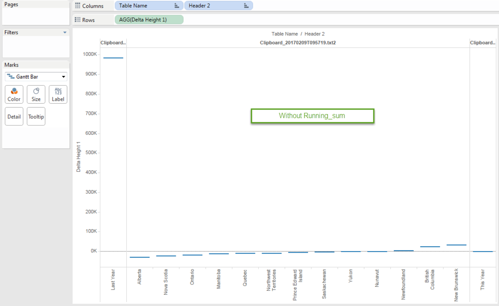
Because the delta should be cumulated and sorted, add table calculation of "running_sum" and sort acsending.
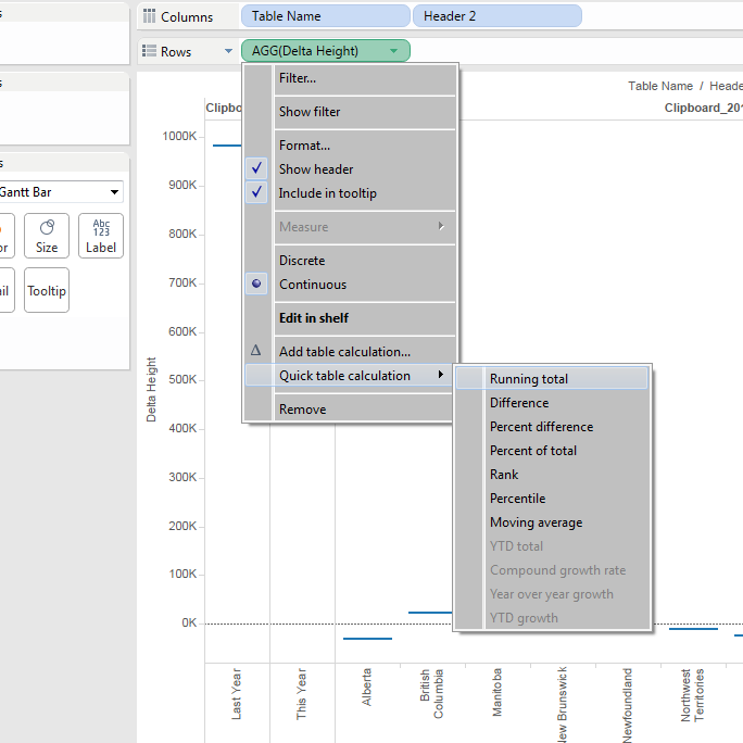
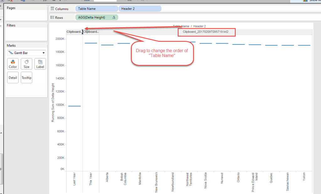
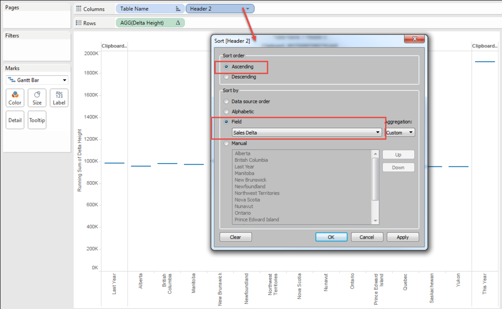
You can see the height with "running_sum" does not work on "This year", because this year is already the result of "Last year" + "Delta".
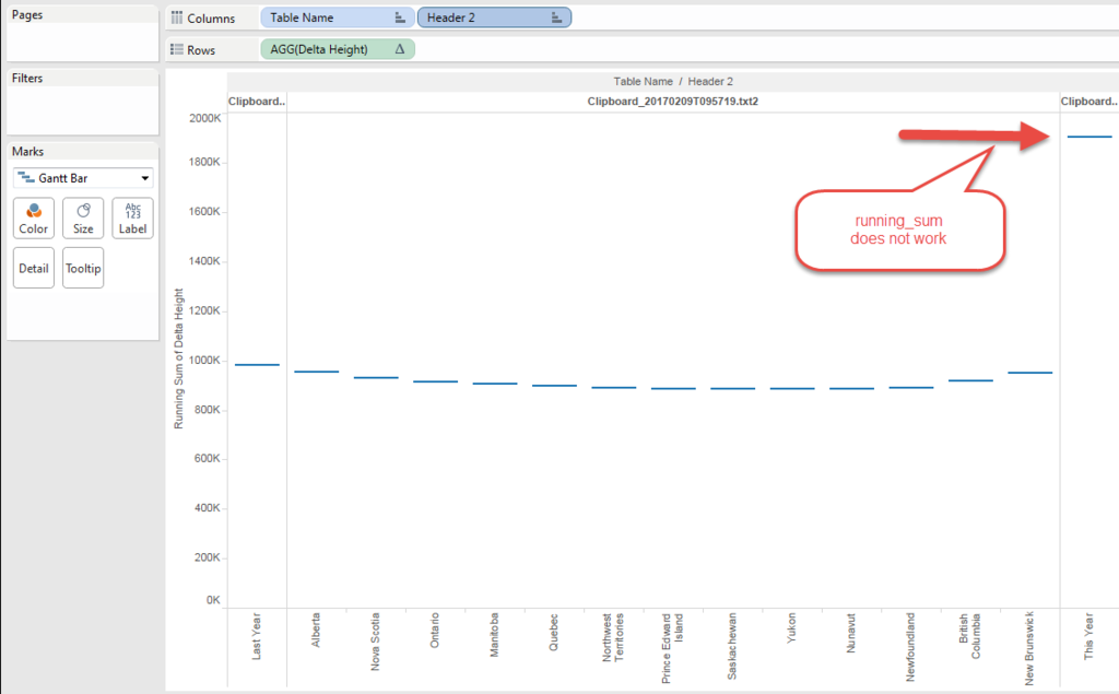
So I need to chage the formula little bit.
[Delta Height 1]
if attr([Table Name])="Clipboard_20170209T095719.txt"
then min([Sales Last year])elseif attr([Table Name])="Clipboard_20170209T095719.txt1"
then 0
else [Sales Delta] end

Height is done!!
Then try put "Size".
Again, the sie should be negative becasue that color need to connect the gap between the current height and previous( next left ) height.
Plus, for "Last Year" and "This Year", whole the "Height" should be the "Size" to fill to the bottom of the chart.
[Delta Size]
if attr([Table Name])="Clipboard_20170209T095719.txt"
then - min([Sales Last year])
elseif attr([Table Name])="Clipboard_20170209T095719.txt1"
then - min([Sales This year])
else -([Sales Delta])
end
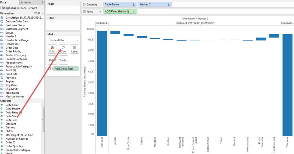
We got it!!
Then Text.
Because the "Size" is negative, to put text label we need to add field for text.
Simply
[Delta Text]
- [Delta Size]
Then put color.
When we put [Delta Text] to color, the delta color is not recognizable becasue the scale is too much different from "Last Year" and "This Year".
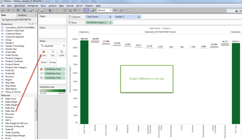
So we also need to create another calculated field to show "Color".
[Delta Color]
if attr([Table Name])="Clipboard_20170209T095719.txt2" then [Delta Text]
else 0 end
We can force the "Last Year" and "This Year" value as 0 only show the value on "Delta", by specifying the [Table Name].
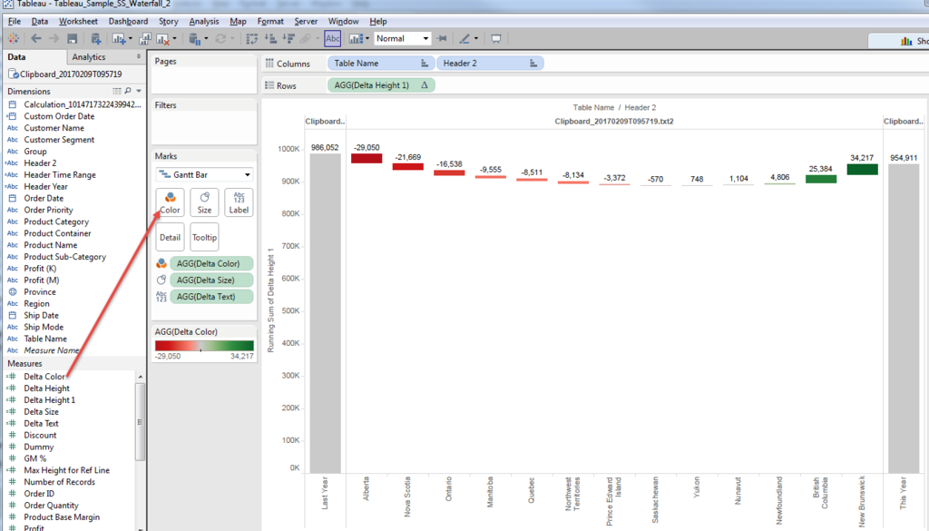
Much better.
Then the merit of this approach is very flexible Y-axis modification.
For example, when we'd like to highlight the "Delta" scale.
I know not starting from "Zero" on Bar graph is sometimes not good way, though,
I understand the request is also reasonable.
In case of Gannt Chart, "excluding Zero" does not change the Y-axis range.
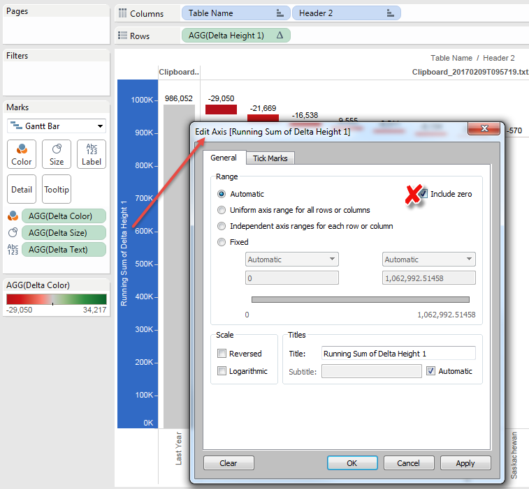
Because the size of both left/right end reaches to the bottom.
Anyways,we want to specify the minimum line.
We want to use 90% o the minium value with round.
[Minimum]
round(window_min(running_sum([Delta Height 1]))*0.9,-4)
Then we can shorten the size of Gantt with this line.
[Delta Size 2]
if attr([Table Name])="Clipboard_20170209T095719.txt"
then - (min([Sales Last year])-[Minimum])
elseif attr([Table Name])="Clipboard_20170209T095719.txt1"
then - (min([Sales This year])-[Minimum])
else -([Sales Delta])
end
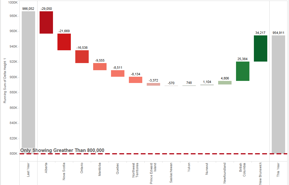
And add [Minimum] to reference line.

And change the format a little bit.
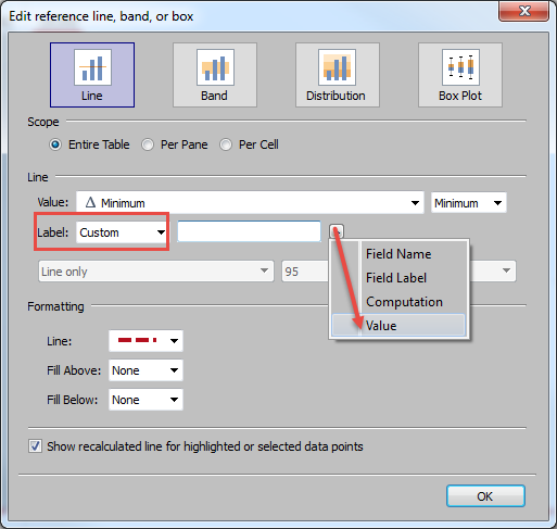
Only Showing Greater Than <Value>
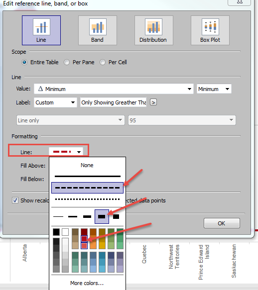
Hide Header
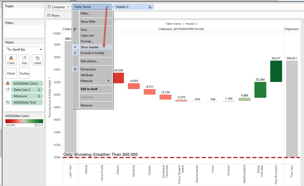
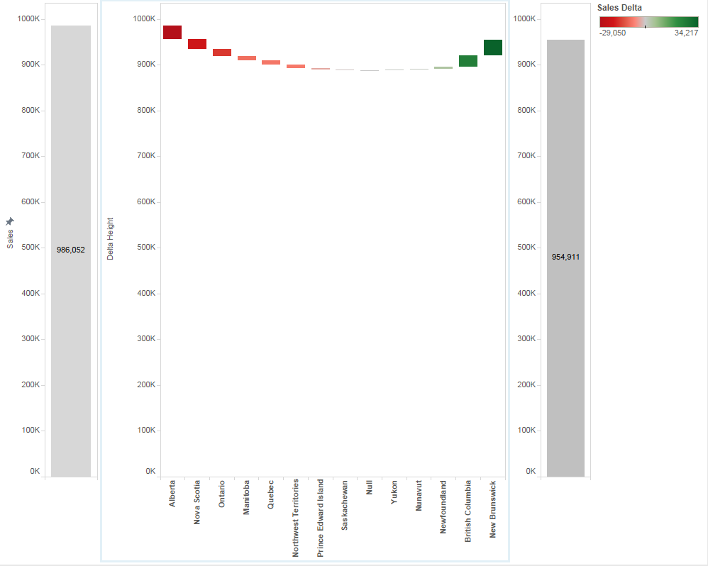
And finally got the chart like this.
This becomes another long post....
Anyways,
Enjoy Tableau !!
Example of Water Fall Charts -1
Temprture is getting wamer and spring is aruond the corner!
I got couple of questions regarding Water Fall Chart.
So I post the one exapmle here.
Of course there are multiple methods to create the charts and this is not always the simplest way.
Goal is....
Compare This year's "The latest full three month" and "Last year's same period"
For example, today is Feb 8th , so we need to compare 2016/11~2017/02 with 2015/11~2016/02.
And we also need to show Delta break down.
The Final Chart image is like below.
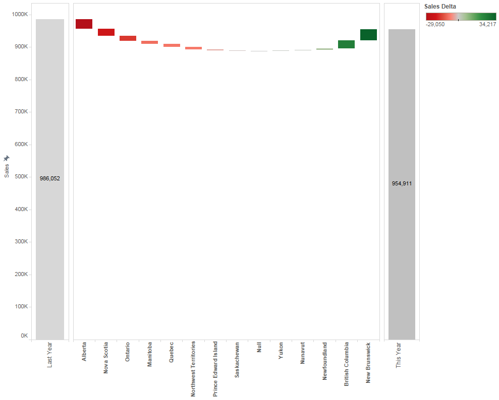
Starting from Calculated Field.
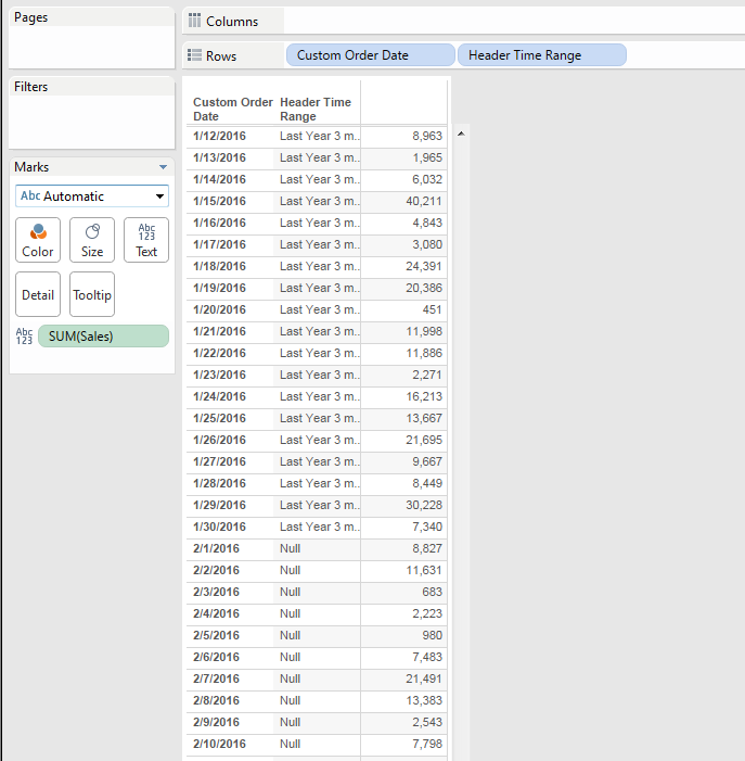
[Header Time Range]
if [Custom Order Date] <= datetrunc('month',today())-1
and
[Custom Order Date] >=dateadd('month',-3,(datetrunc('month',today())))
then "Curent 3 months"
elseif [Custom Order Date] <= dateadd('month',-12,datetrunc('month',today())-1))
and
[Custom Order Date] >=dateadd('month',-15,(datetrunc('month',today())) )
then "Last Year 3 months"
end
Datetrunc brings the first date of month and "datetrunc('month',[date])-1 " brings the last date of last month.
"dateadd('month',[date])" is shifting the date by month.
One note here is that to shift one year, we'd better use "12 months" than "1 year" to avoid an error on "2/29 of Leap Year".
It correctly select the range.
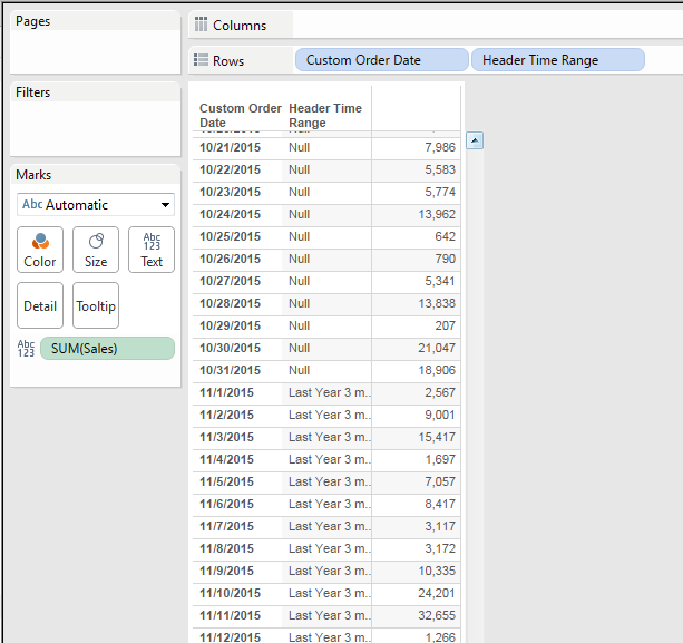
We will create three worksheets and combine on Dashboard.
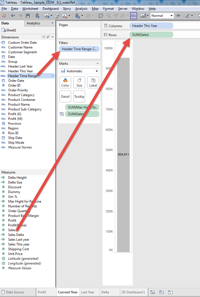
1. Current year Worksheet (Bar Chart)
Put "Sales" on Rows and Put "Header Tiemn Range" on Filter.
Then select "Curent 3 months" on filter.
2. Last year Worksheet (Bar Chart)
Put "Sales" on Rows and Put "Header Tiemn Range" on Filter.
Then select "Last Year 3 months" on filter.
3. Create Delta Worksheet (Gantt Chart)
First, calculate the delta between this year and lat year.
[Sales Delta]
sum(if [Header Time Range] ="Curent 3 months" then [Sales] else 0 end)
-
sum(if [Header Time Range] ="Last Year 3 months" then [Sales] else 0 end)
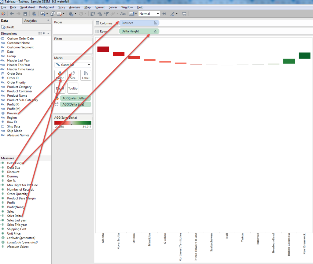
Gantt is consist of "Heighet" and "Size".
Height:
[Sales Last year]
{fixed:sum(if [Header Time Range] ="Last Year 3 months" then [Sales] else 0 end)}
[Delta Height]
attr([Sales Last year]) + running_sum([Sales Delta])
Adding each "Provinve" (in this case) delta on Last year's sales.
Using LOD brings Last year's Sales and using running_sum brings sequential height for respective "Province".
[Delta Size]
-[Sales Delta]
Size should be "Negative" in this case, because the hight is "Last year" + "Delta".
And the colored part should bridge between Current height and previous height. (Next left)
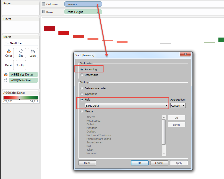
Sort Province with "Delta" Ascending.
The reason to use "Ascending", not "Descending" is to keep the total height of Graph shorter to show maximum Range.
If we take opposite way, the "Hill" is made and grapgh range(height) becomes unneccessarily tall.
Now let's try to put three worsheets on dashboard.
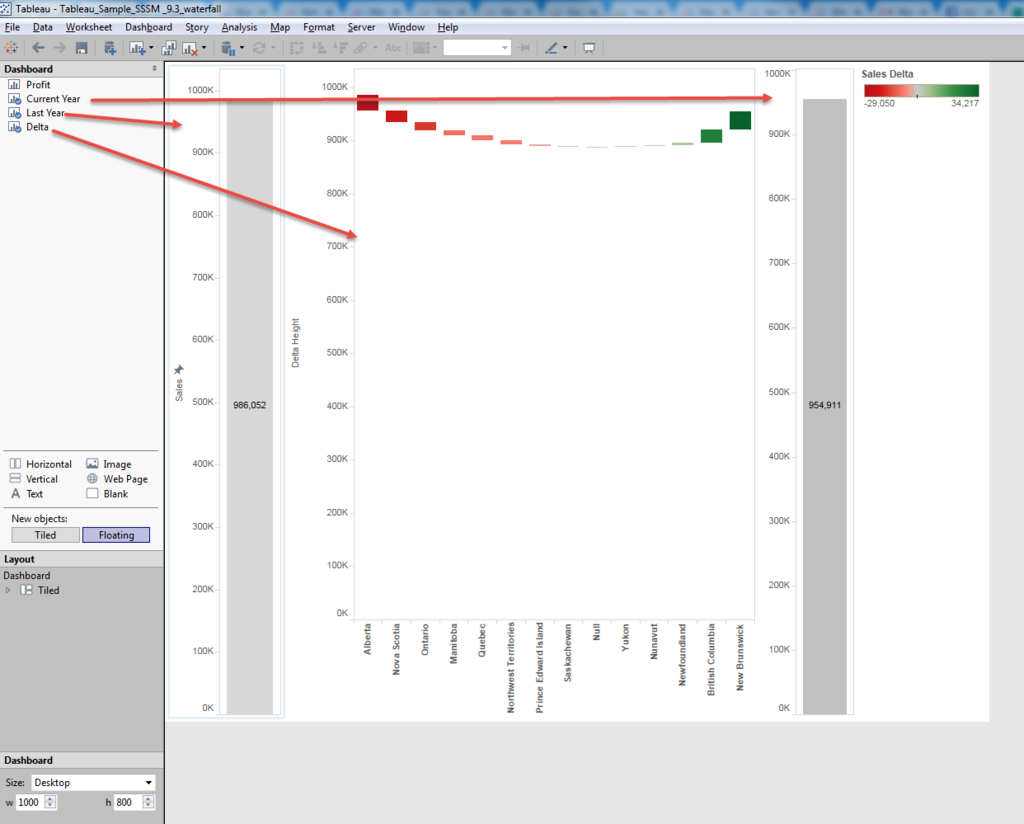
We see couple of problems.
1. Height is not aligned beteween Current and other tow.
2. Y-axis Zero line is not alighned between Delta and other two.
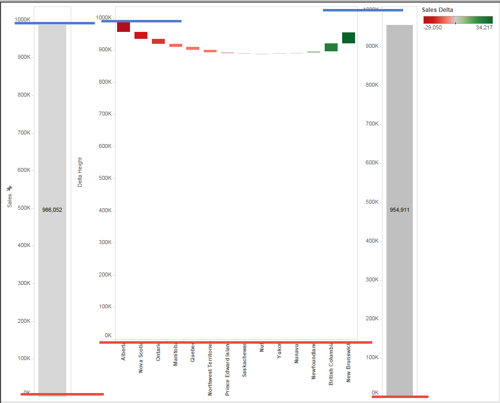
Then, to align height, we use "Reference Line"
In all the case, we need to pick "highest point across three worksheets".
Because we sorted Delta as acsending, the highest point is max of last year or this year.
[Sales Last year] // already exist
{fixed:sum(if [Header Time Range] ="Last Year 3 months" then [Sales] else 0 end)}
[Sales This year]
{fixed:sum(if [Header Time Range] ="Curent 3 months" then [Sales] else 0 end)}
[Max Height for Ref Line]
max([Sales Last year],[Sales This year])
Put [Max Height for Ref Line] to Detail shelf and set "Reference Line".
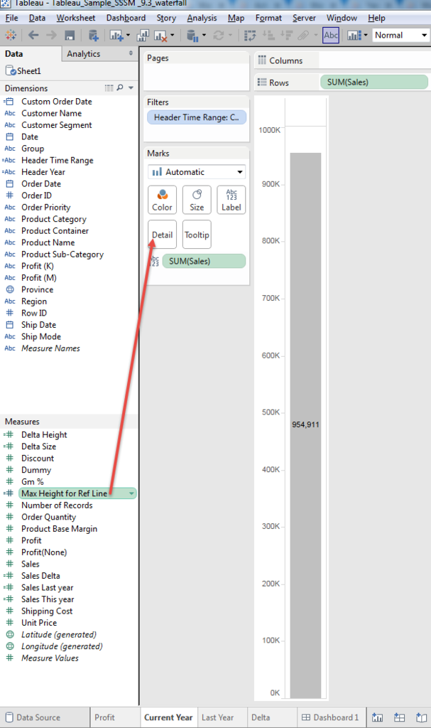
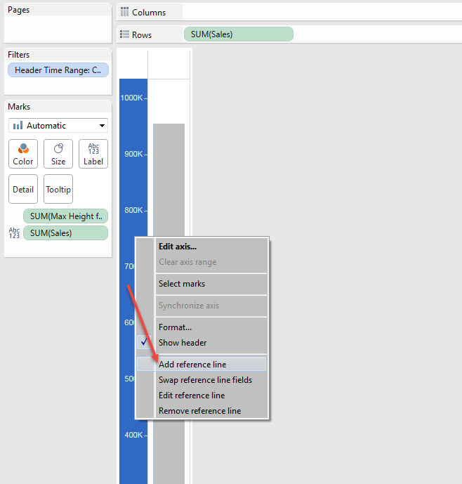
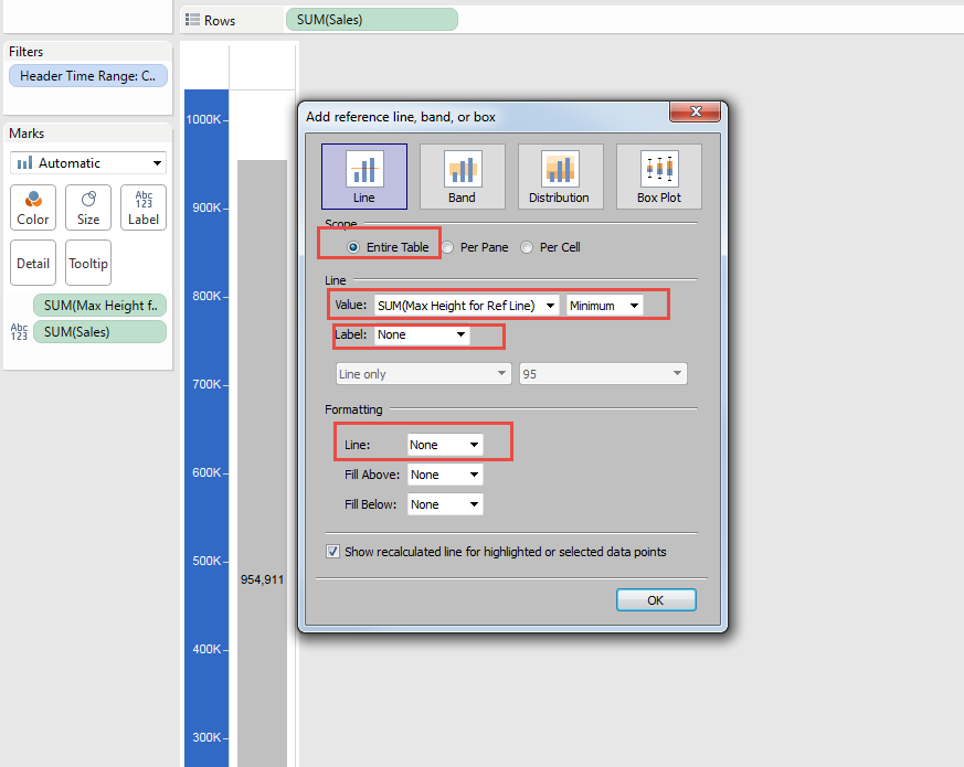
Same thing for other two sheets, and let's see dashboard.
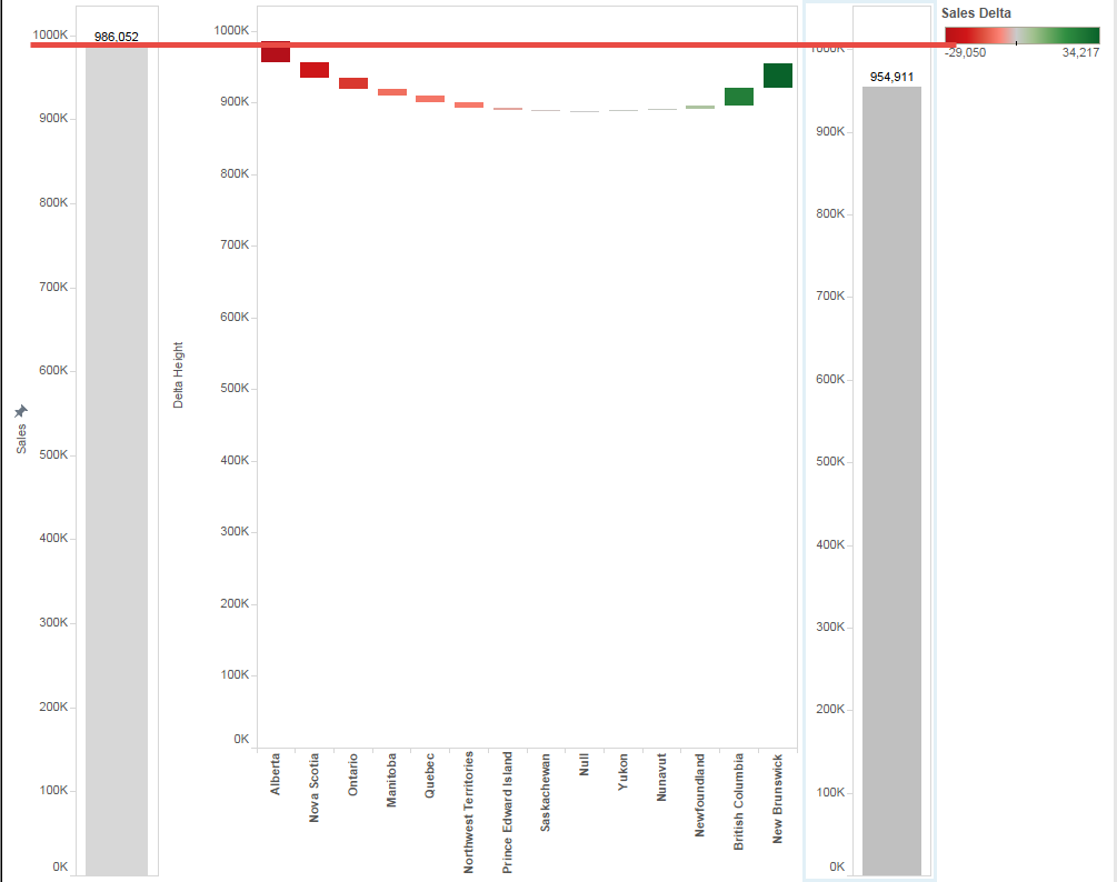
It's still miss-alighed.
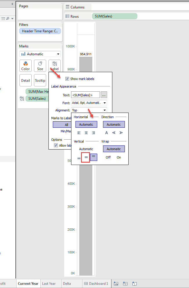
Because of "Text" on top of the bar chart.
We still want to keep the text, so change the positoin.
Let's see the dashboard again.
Now last year and Current year is aligned, but Delta still little bit off.
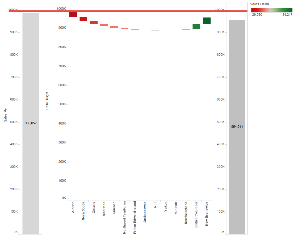
We need to align Zero Line to fix this.
We can add "Blank" box on Dashboard, but I'm afraid it changes the size according to the screen size.
To algen Zero line, we need to add dummy header.
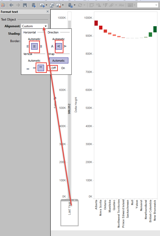
Let's fix Wrap or Not because it changes the Zero line position under "Automatic setting"
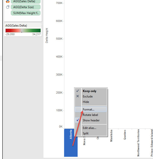
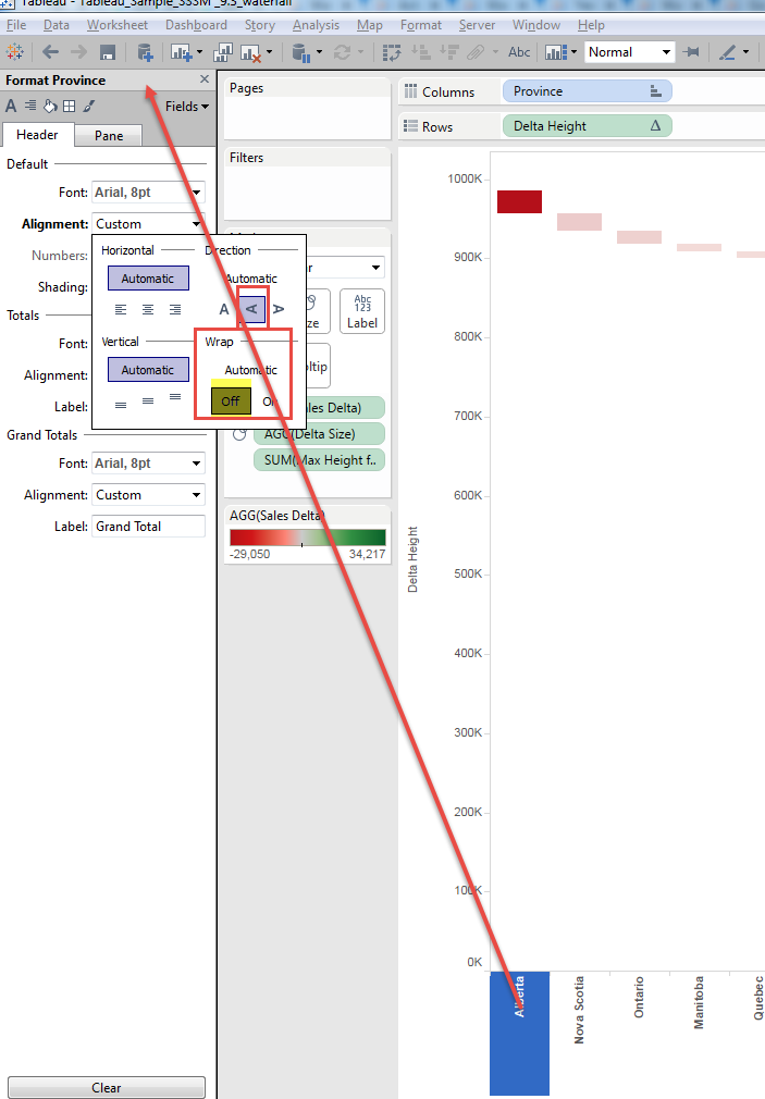
Then we add Header to Last year and Current year worksheets.
To align the height of header, we want to pick longest Province name
[Header Year]
{fixed:max(if len([Province])={fixed:max(len([Province]))} then [Province] end)}
Then put this field to both sheets.

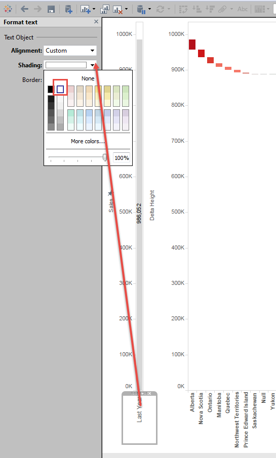
Then Change the Font color of Dummy Header to white.
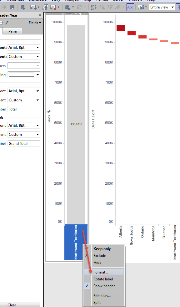
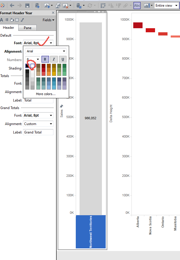
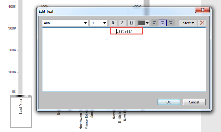
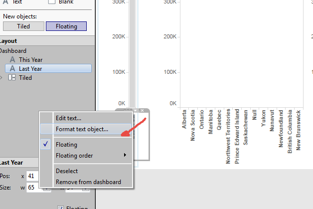
You can add "text" tile with floating.
(This is off-position little bit when the screen size changes)

Same thing for Current Year.
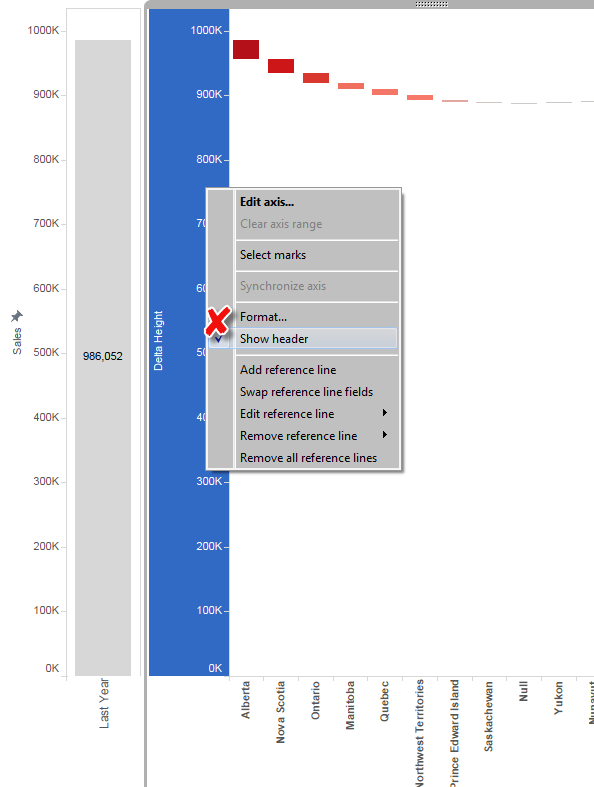
Then Hide Header from both Delta and Currenmt Year.
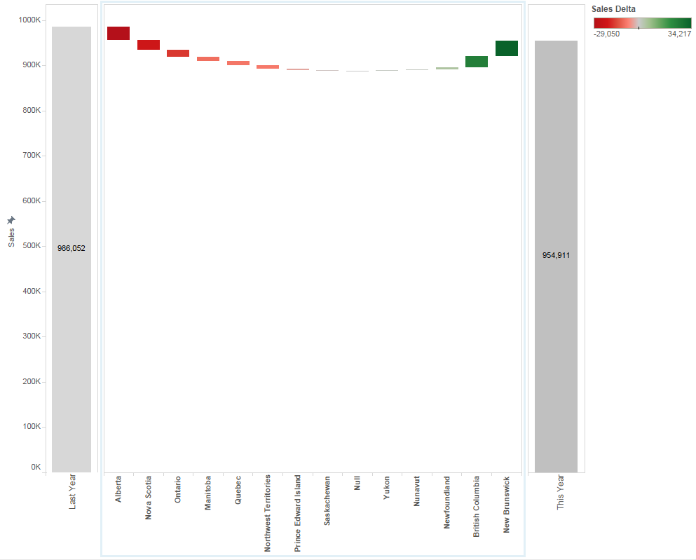
Finally you got completed water fall chart.
Enjoy Tableau!
God is in the details - Change the Header Position to TOP-
God is in the details-
I'm not sure this idiom is undertandable in English or not, anyways, what I'd like to say is if the detail is good entire sysytem should be good.
Of course this kind of idiom is not alwasy true, but I think this matches the case I explain today.
Here is a simple chart.
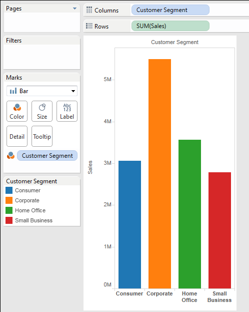
Now add Cutomer Category on Column.
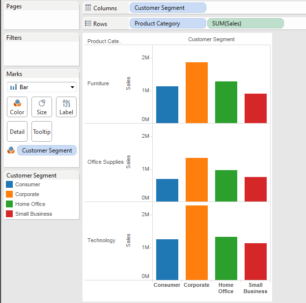
Becasue we have multiple Bar charts on columns, we want to move the [Cutomer Segment] Header to the Top to narrow the distance from Top chart to the header.
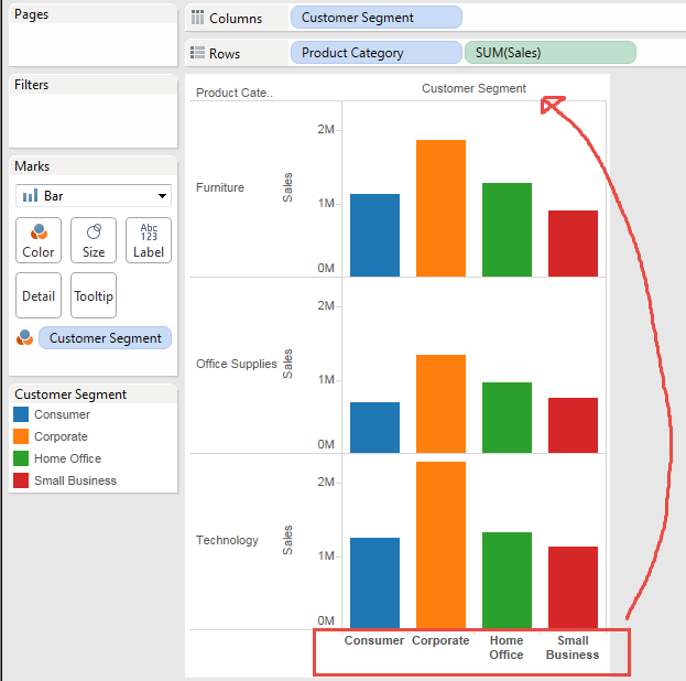
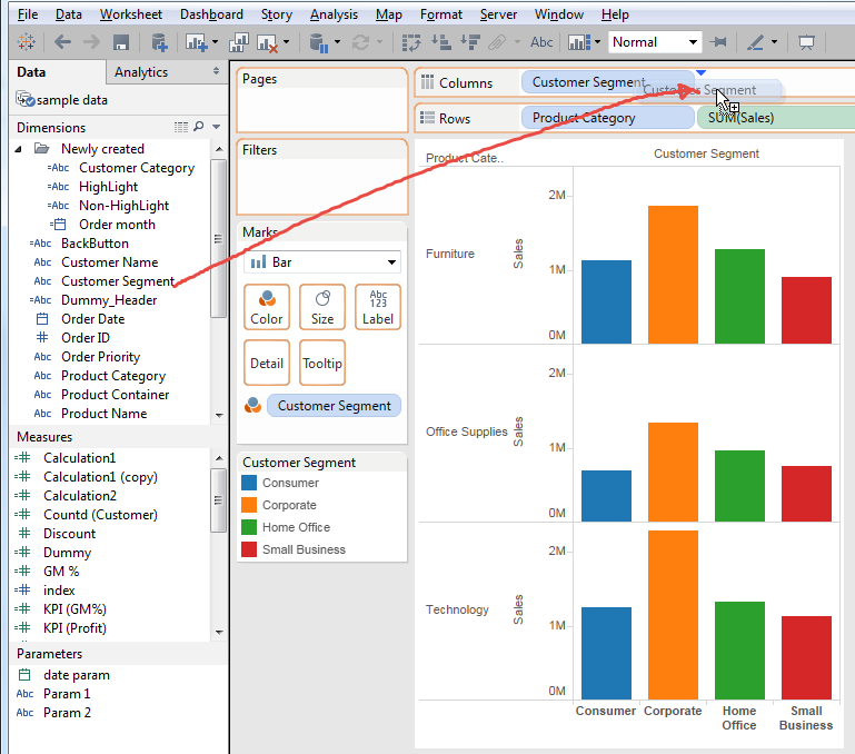
Let's try to add same pill of [Custoemr Segment] on Columns.
The results looks like below.
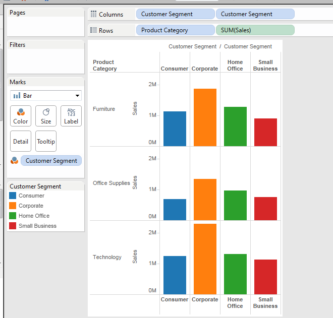
We got headers on both top and bottom.
This is good, but little bit noisy.
So, we want to remove the header from bottom.
Let's try to hide header of the bottom.
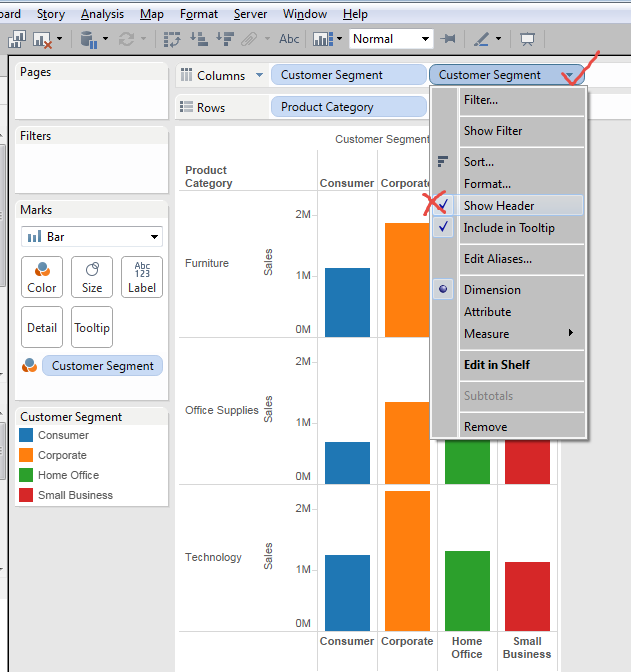
End in this results.
Both headers are gone unexpectedly....
This does not work.
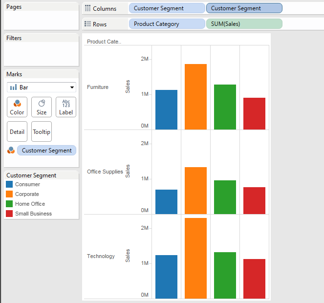
.
Ay other idea?
Yes, we can try to add other field.
Which field is good? We have a clear condition requirement.
If the field has multiple values, it impact to the view itself. Then the field should have only one value.
Simply saying, we'd better add one dummy field, like this.
[Dummy_Header]
"A"
It's better to put string than numeric value because handling numeric value is more troublesome that string value.
Let's put this [Dummy_Header] into the columns at right side of [Custoemr Segment].
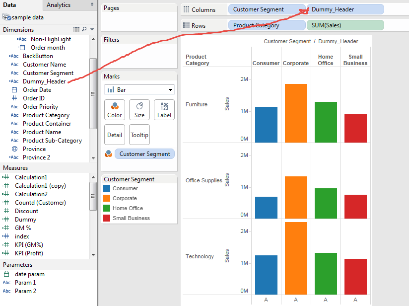
Looks good. Now uncheck "show header" of [Dummy_Heaser]
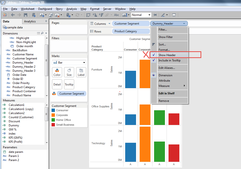
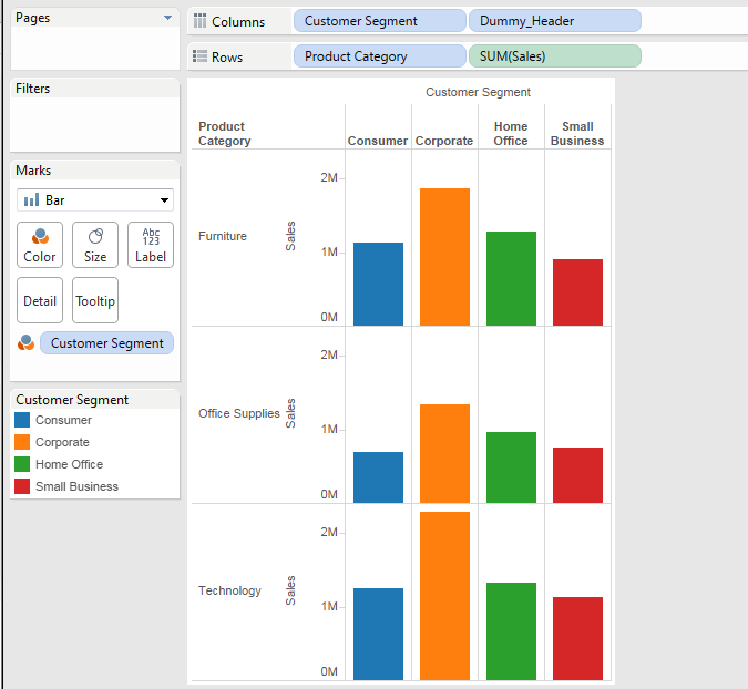
Yes, this is what we wanted.
This is good opportunity, so let's try some extreme cases.
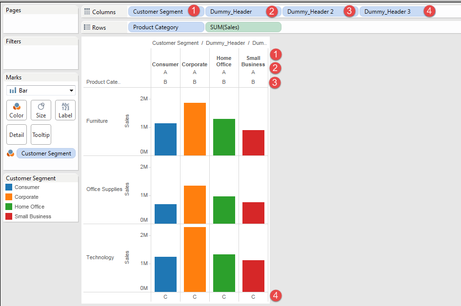
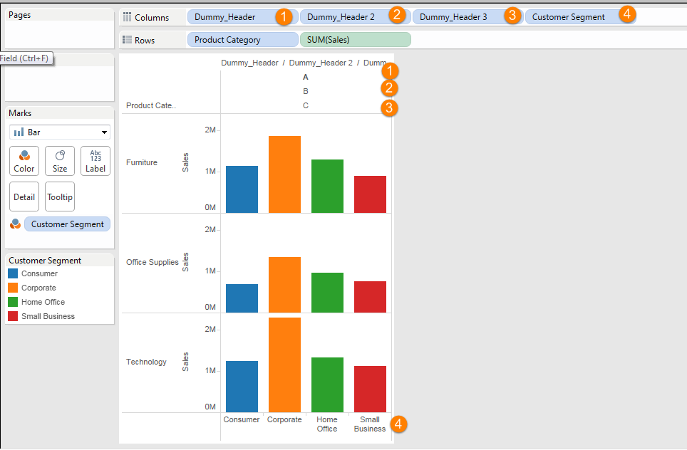
You can see the right-end field's value is set as the bottom Header, and rest of fields' value are set as top headers with left side field as higher positioin.
Very samll TIPs, but better to have!
Enjoy Tableau!
Common misconception - Cannot Draw Stacked Line Chart? -
This is a kind of common misconception accordin to my experience.
That is "We cannot draw stacked line chart."
I heard this comment from multiple people, even I did think so until recently.
The reason is, when I create simple charrt with dragging below three pills on the each field, Tableau automatically draws a chart as below.

One confusion at very begining as Tableau newby, is difference between Line Chart and Bar/Area Chart.
When we change the cahrt type to "Bar", the graph cahnged as below.
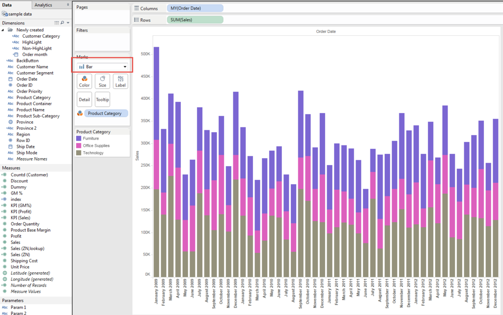
It's stacked.
Then change the type to "Area", it's also stacked.

From this behavior, I missunderstood that Tableau cannot draw stacked line chart.
But that's not true.
Again, there is check/uncheck problem.
Go back to line chart, and go "Analysis" from menu bar.
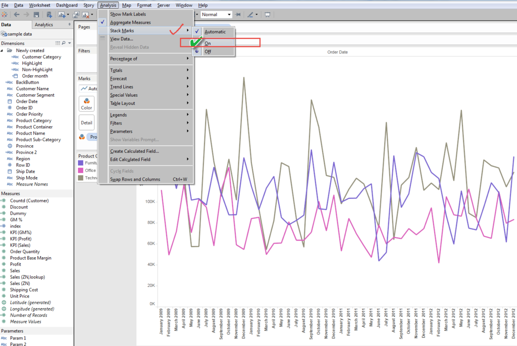
Then you can get stacked AREA Chart !!??
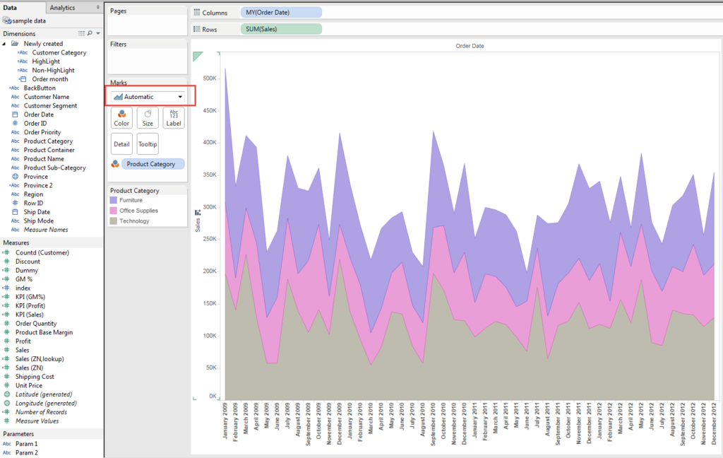
This was a second reason I thought that Tableau cannot draw Stached Line Chart.
But we can see the chart type shows "Automatic".
Now we change the type to "Line" again.
Finally we got stacked Line Chart.
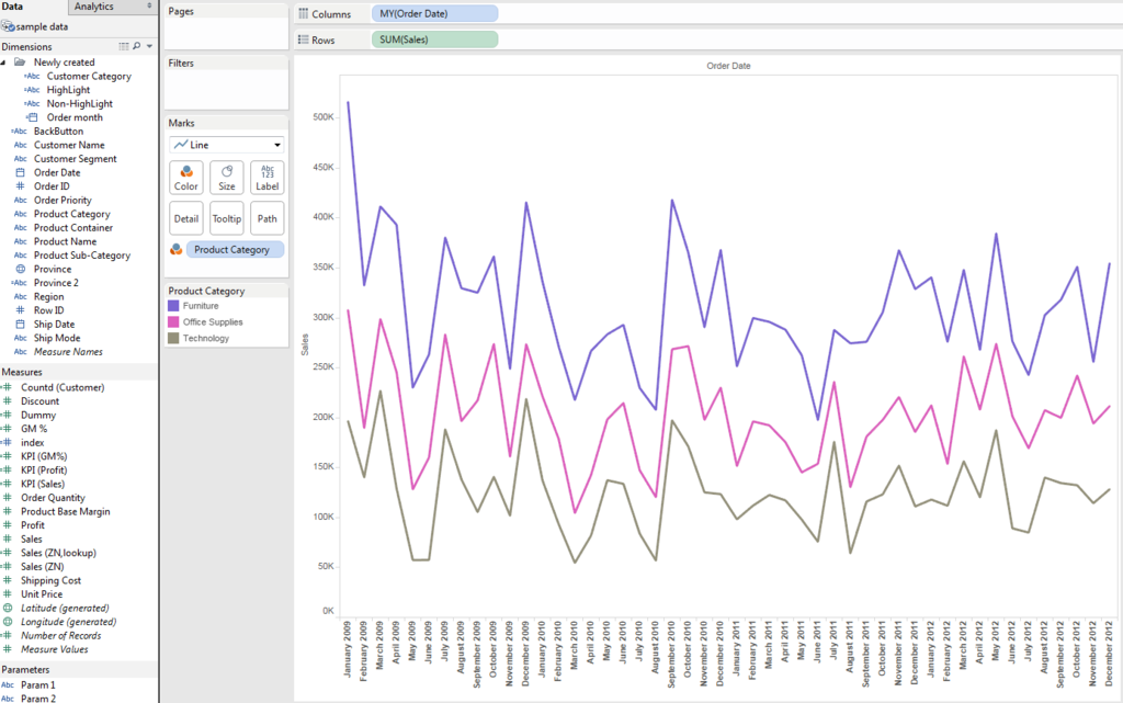
On the other hand, when we change the chart type to "Bar" and stack mark to "Off"
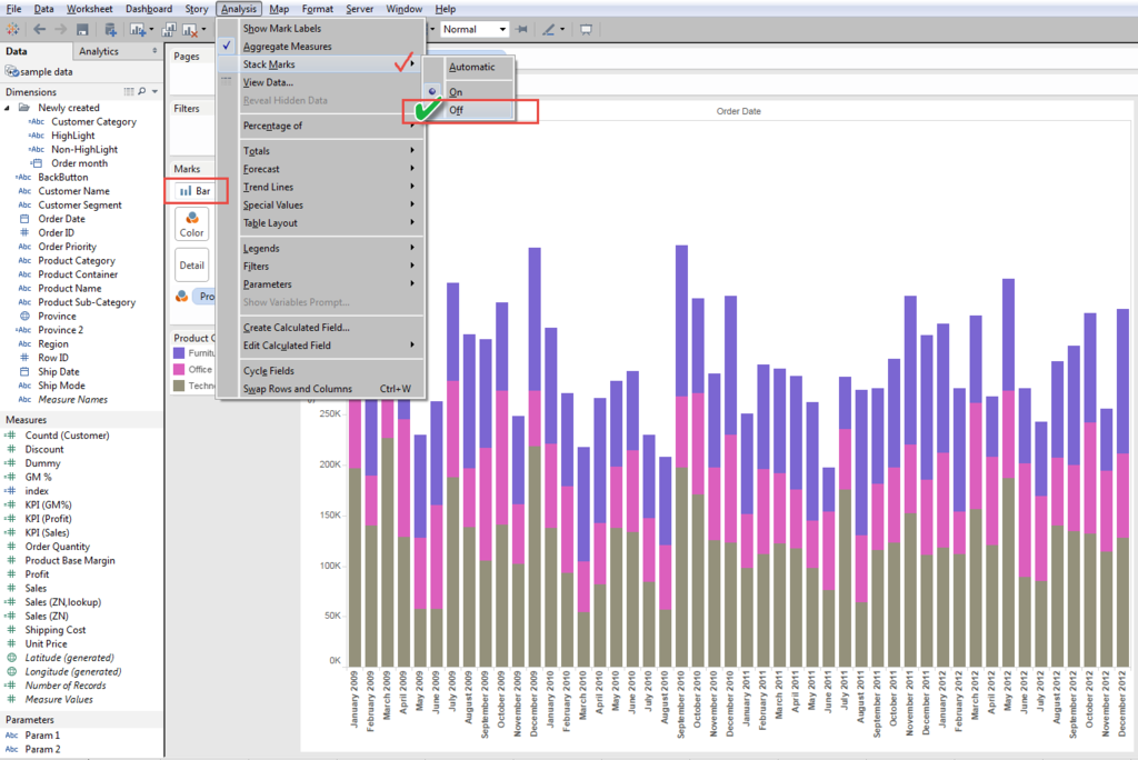
we got non-stacked Bar Chart.
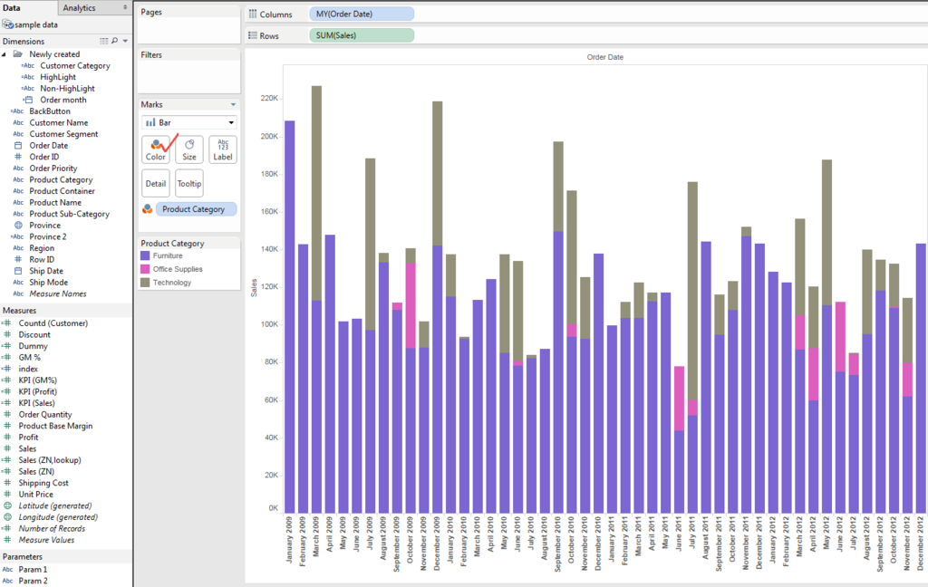
In this view, the color is overwrapped and does not make sense as a chart.
So, change the color transparency,
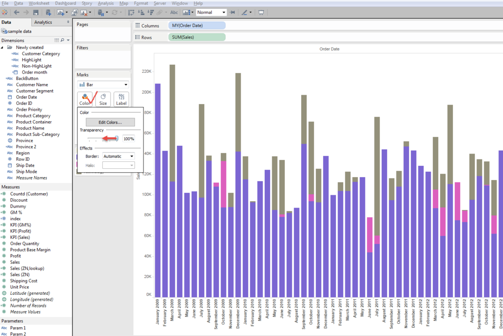
and got below view.
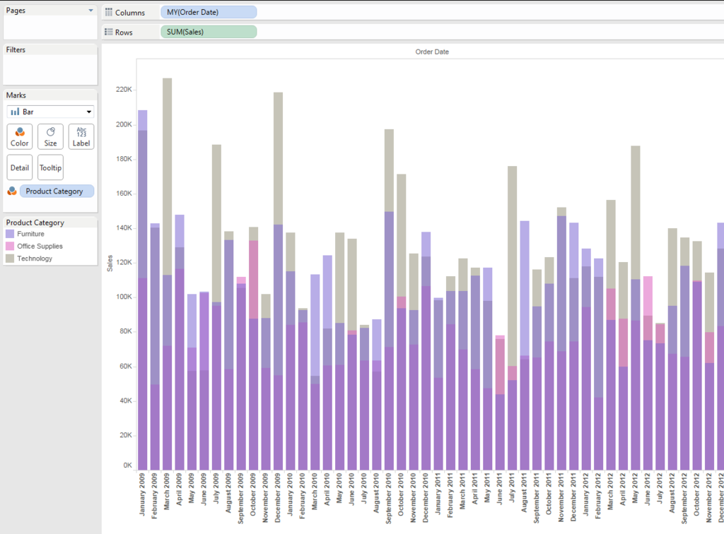
Also on this non-stacked bar chart, with changing the order of category in color shelf, we can change the order of layer of color.
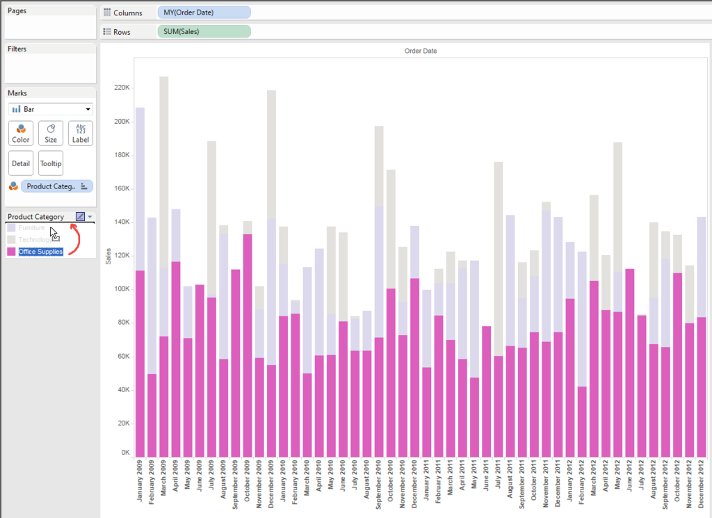
Like below.

Enjoy Tableau !!
It's equipped with One Check/Uncheck - Show Blank Cells in the Table
Sometimes easy view takes 100 of steps to be created.
But somtimes it's done only by one Check/Uncheck.
I got a request that he wants to show the "Blank" Cells in the table.
He wanted to show the table like below.
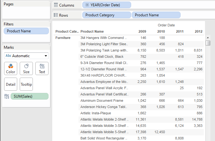
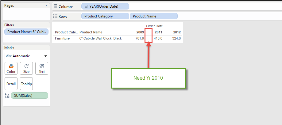
This looks good, but when we filtered 4th Item of " 6" Cubicle Wall ***" as an example, the table becomes like below.

It seems good at a glance, but you can see it excludes Null Value and doesn't show Yr2010 data in the column.
So, the question was how to show this colum in the table.
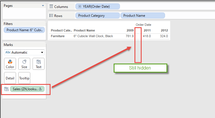
I tried to use the formula which can put "0" in the table.
[Sales (ZN,lookup)]
zn(lookup(sum([Sales]),0))

But when I filter this item only, the view still hides Yr 2010.
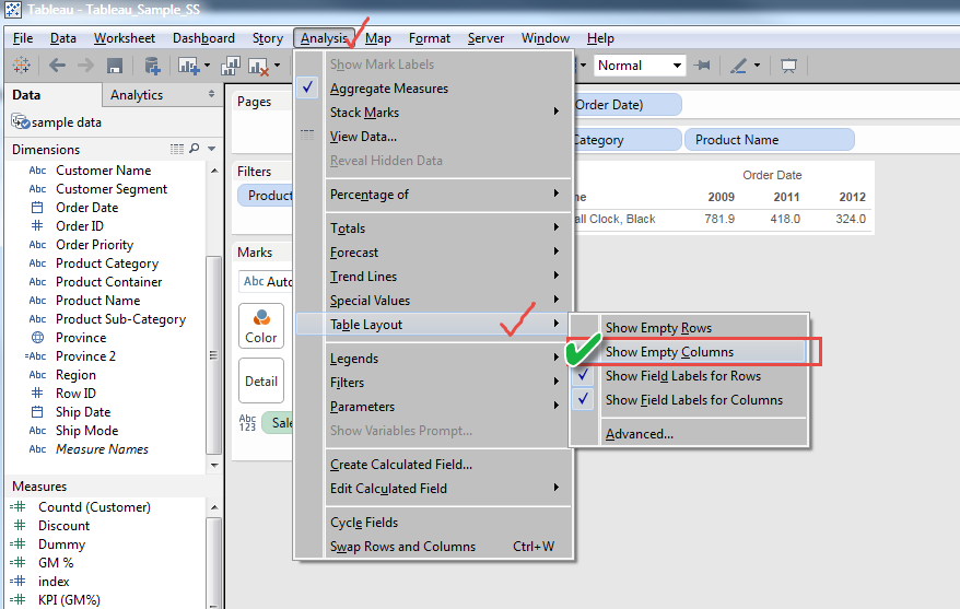
The answer was quite easy AS LONG AS you know it.
Check "Show Empty Columns"
It still does not show the missing column like this.
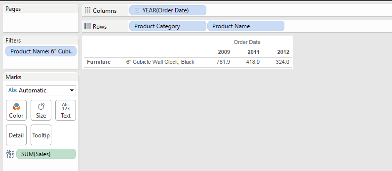
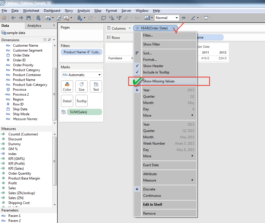
That's the reason I was confused, but one more check, which is "show missing value".
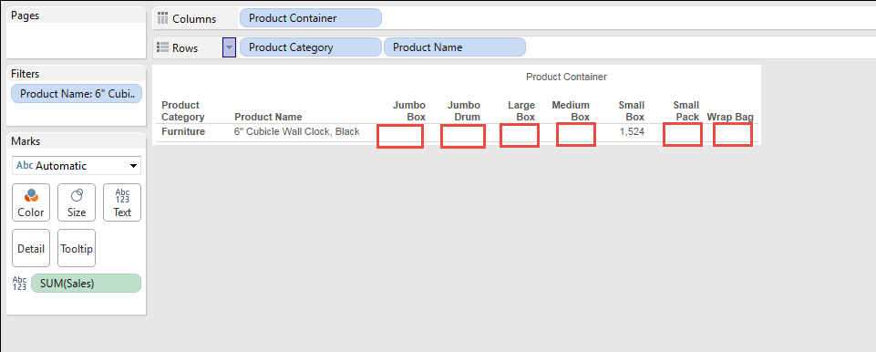
If the column is the dimensioin which is not "Date" related, without checking "show missing value", you can display blank cells like this.
One thing we need to pay attention is "Filtering"
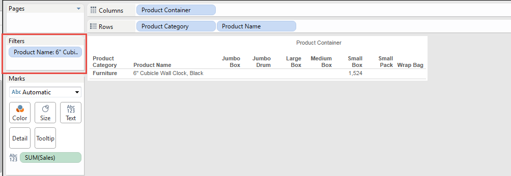
At this point, we only filter "Product Name".
But when you click the triangle of Column of "Product Container", (right corner of the pill)
and select Filter,
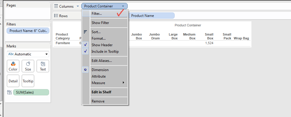
It brings below window.
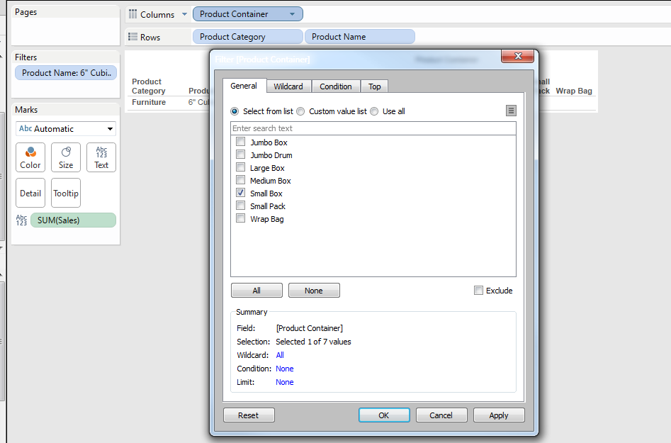
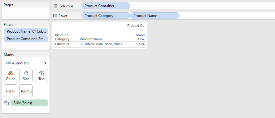
When you click OK, the table changed as below unexpectedly.
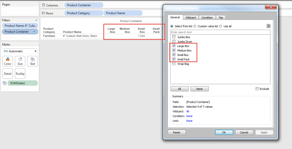
We can remove the filter to show all the items or we can select items which we want to show just as usual filtering fuctions.
There are still many things we need to learn.
Enjoy Tableau !!
Such a simple view, it required 100 steps!! - Having Multiple KPIs -
Olympic is ongoing and this is the typical timing when people in U.S. think about their nationality.
It's natural for two BIG countries to compete the number of Medals, but I'm afraid that they compete each other too much seriously in every arena.....
Today's topic is one of most famous FAQ.
That is
- "How to Put multiple KPI in the table" or
- "How to Put different color to multiple Measures"
The Final VIZ I want to create is like below.
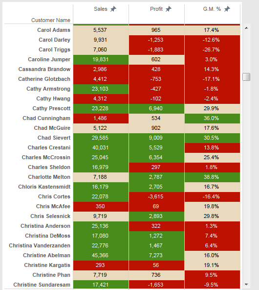
Three different measure (Sales, Profit, and G.M.%) must have different color.
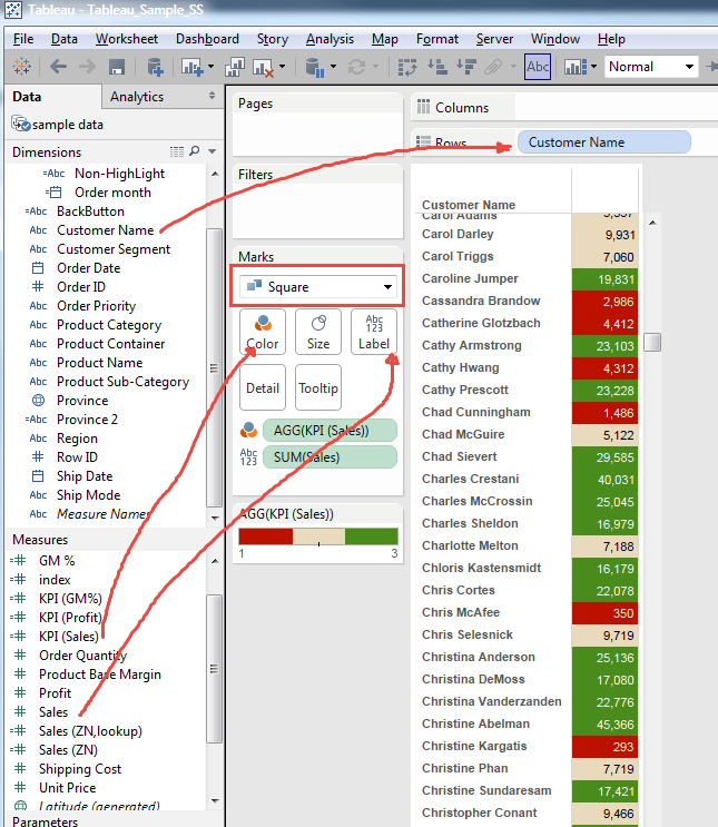
It's easy to put one measure in the table and color them by only one KPI.
For example, putting Sales data and Sales KPI as color, we can get a table like this.
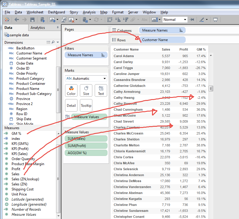
Also it's easy to put three different measures in Column without color KPI.
But when you try to put colors on these three measures, we will see all three measures show same color.
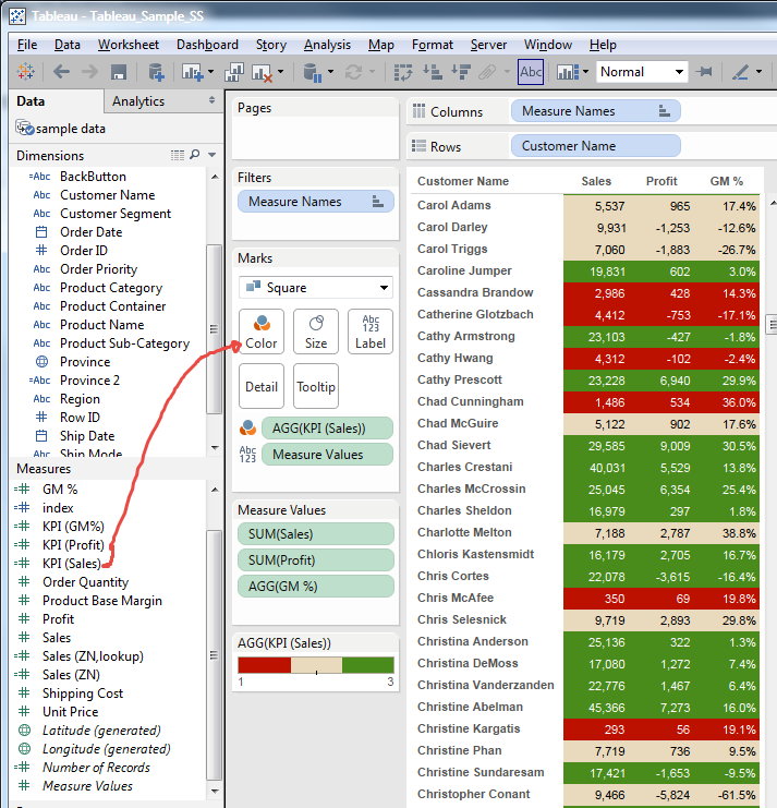
In other words, Profit and G.M.% are also showing "Sales KPI color". Defenitely, this is not we want.
Again this is one of the most frequently asked questions and this is fairly common view.
And we have the answer.
However, this is not a kind of "Here is an answer !" type of situation, but level of "This will work if you really need something..."
If Tableau want to dominate the position of top BI tool, this is one of the most important function I strongly recommend to add. If Tableau development team think that the problem is already solved with current shared approach, that is not good understandings.
Imagine how difficult it is that community members spend long time to answer this question every day.....
Anyways....
How to approach this problem?
We need "Place Holder" to put fields in, which is "1".
You can add "Dummy" as calculated field with numeric 1.
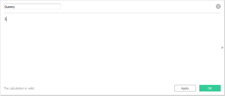
Then put this fields in column with "Minimum" as Measure.
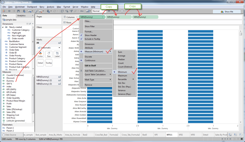
Then copy twice for three measures.
Now we have three Bar Graphs.
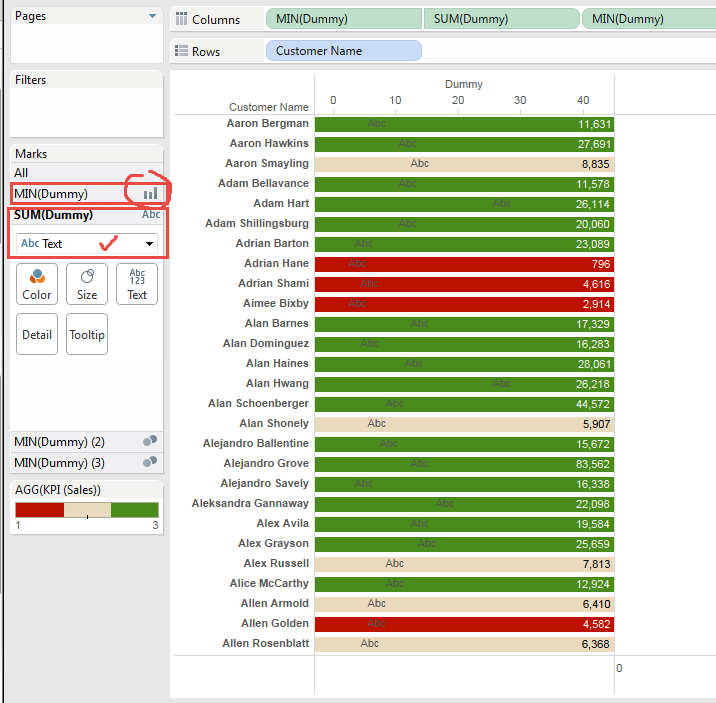
On first Bar Graph put "Sales" filed on Label and "KPI (Sales)" on Color.
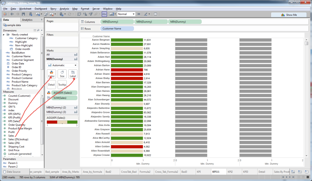
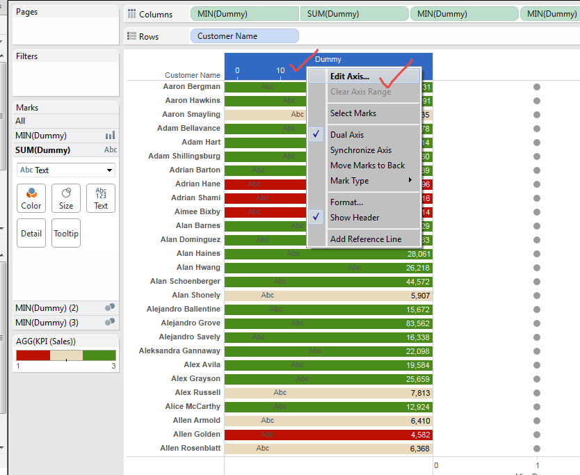
Then edit Axis,
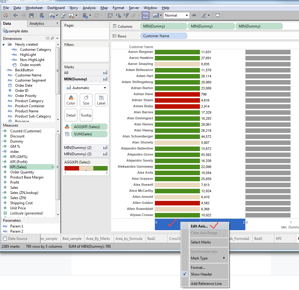
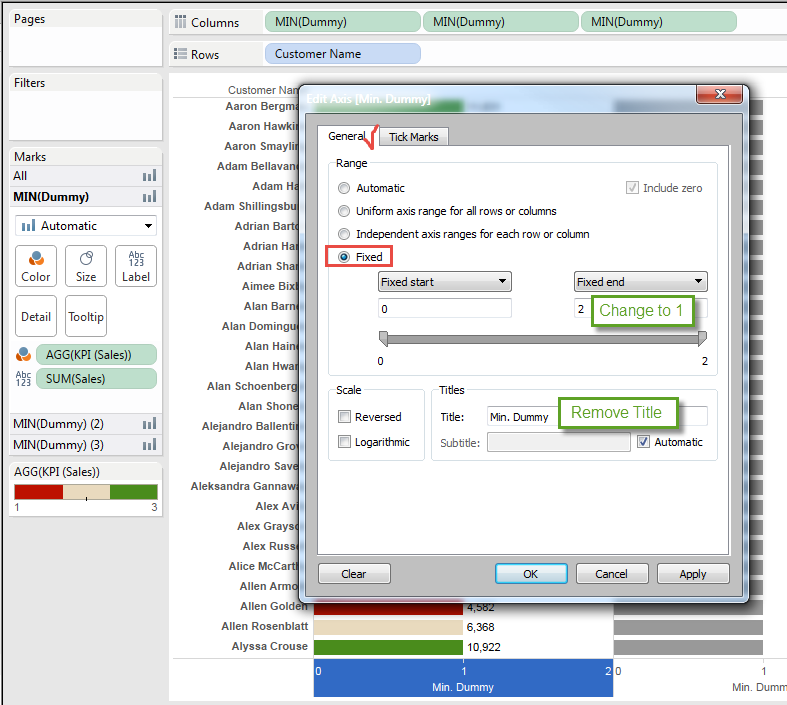
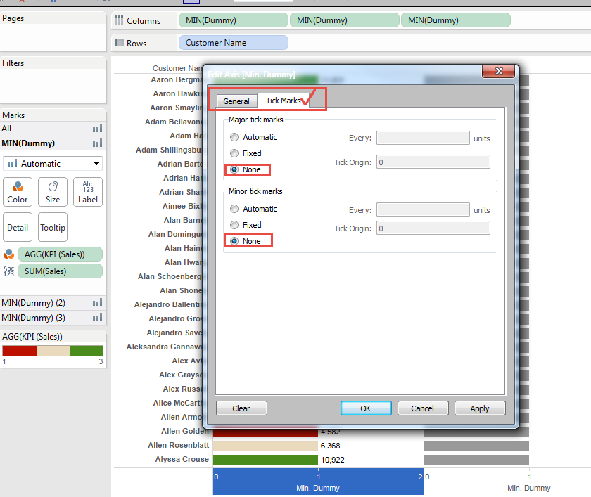
To add Title on the Top instead of Bottom, same field of "Dummy" needs to be put to the secondary Axis.
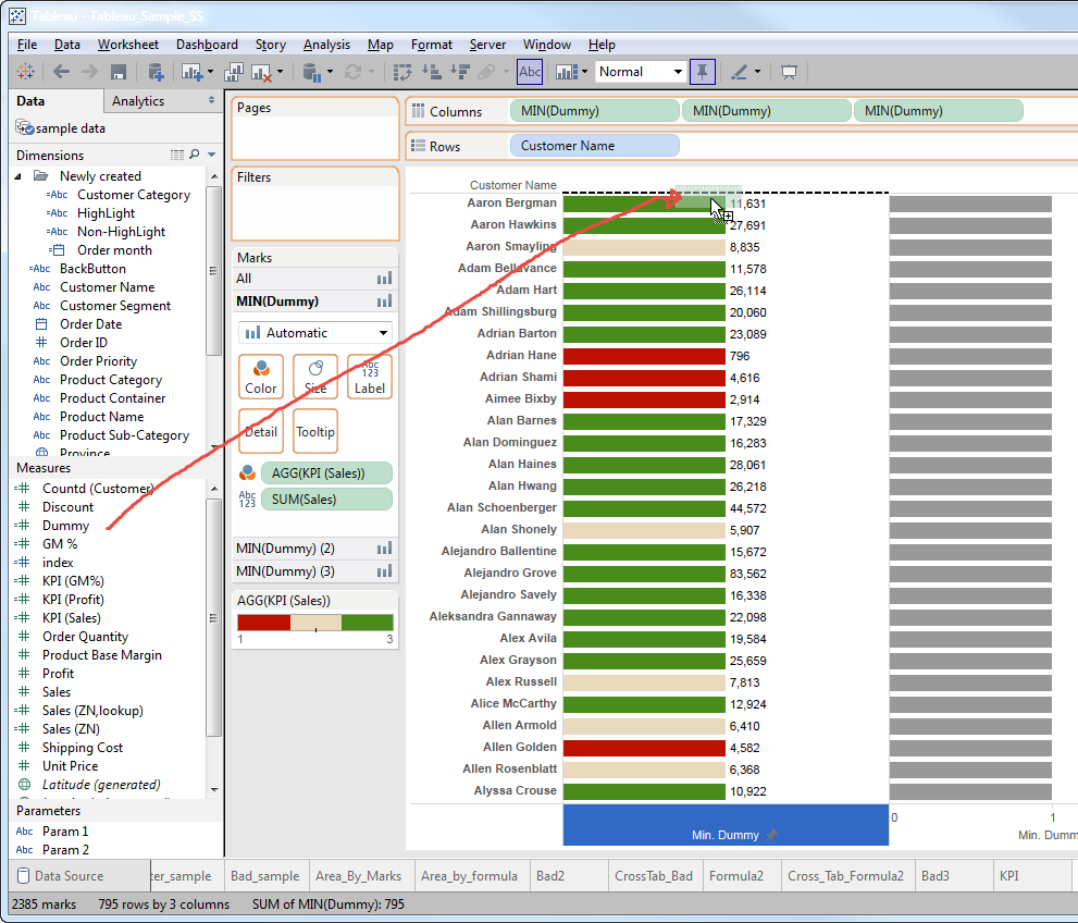
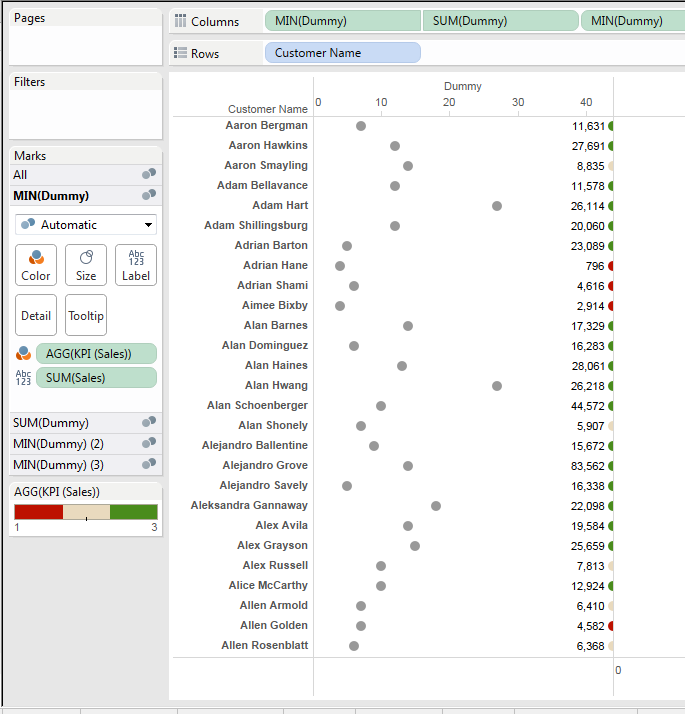
Tableau's "Automatic" chart type assignment sometimes do rediculous job, but don't worry.
Change original Graph type to Bar Chart, secondary Chart tyep to Text.
Actually , we don't care what is the secondary graph type because this is only for the purpose of putting "Header" on the Top Axis.
Edit Axis on the secondary (Top) axix.
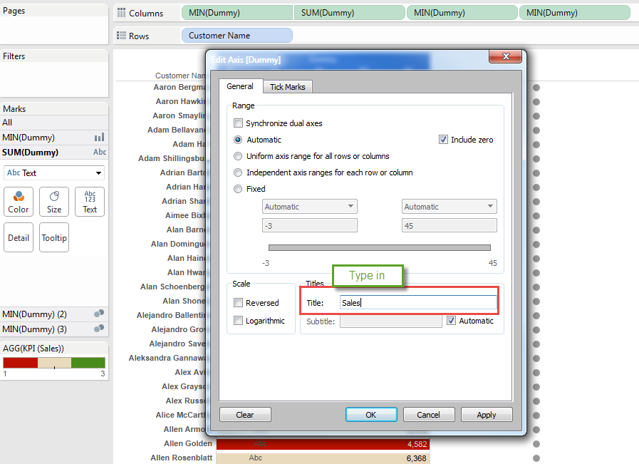
Type in "Title"
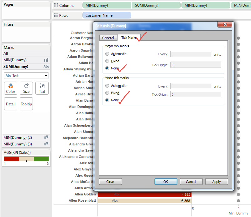
Remove Tick Marks
Then Change the Color Transparency to "Zero"
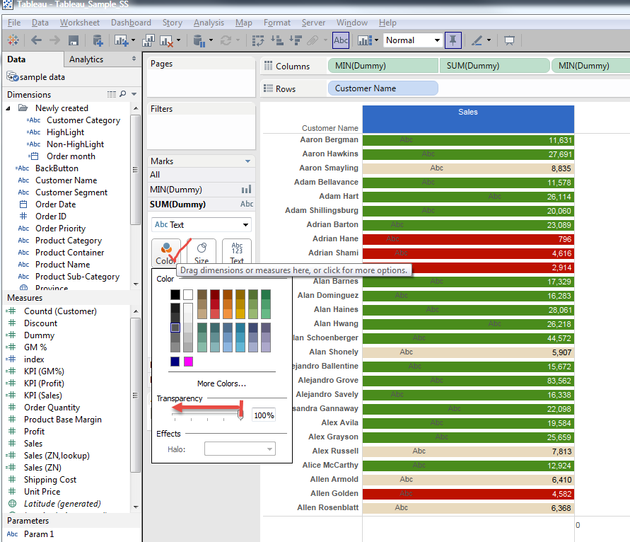
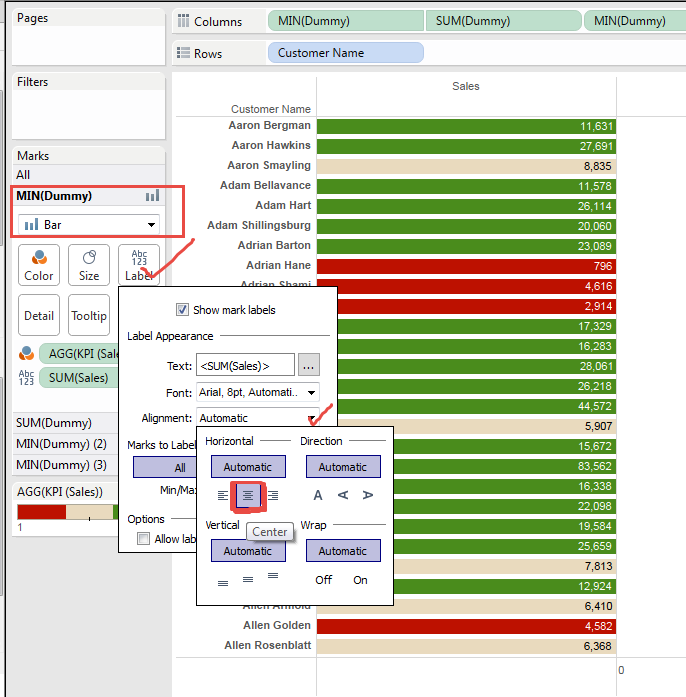
Then Go to Bar Chart and Change the Alignment Horizontal to "Middle".
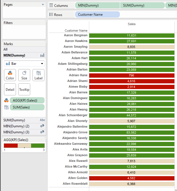
We finally got this view.
And same steps need to be done on two other Measures of "Profit" and "G.M.%".
Now we got this view.
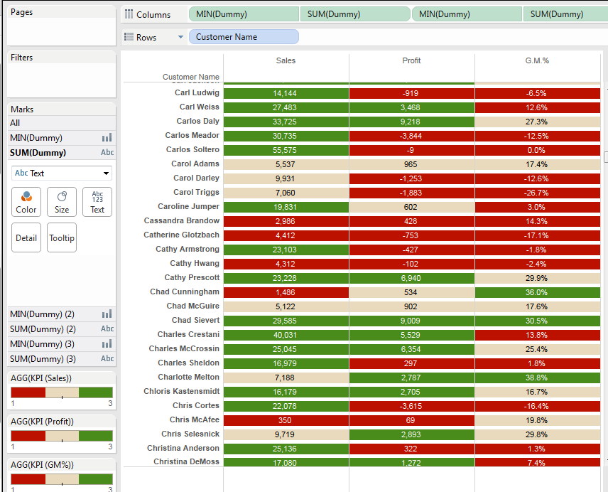
To fill the Gap of vertical "blank", we change the Size of Bar Chart.
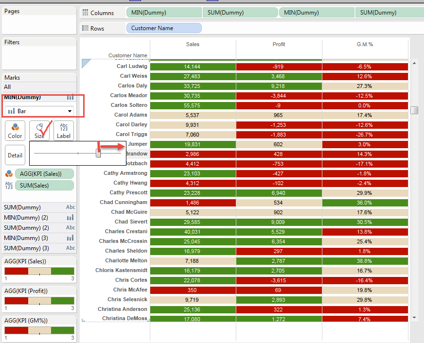
After we do x3 of above, we got this View as Final x Final
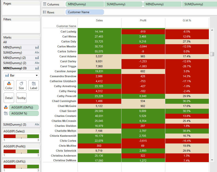
Such a simple view, it required more than 70 steps to accomplish without any failure !!
Considering some trial end erros (Erros require 2x steps),
it requirs 100 steps!!!
I don't have any simpler way to create this type of view.. Definitely Tableau Development Team's awareness and support is neeed.
Tableau community has the feature of collecting "Ideas" and I think below idea is close to our needs. You can vote here of course.
Conditional Formatting of Measure Names/Measure... |Tableau Support Community
Though, one of difficulties, I think, is the way "Naming"/"Expressing" this requirement itself is not consistent...
Anyways, Enjoy Tableau !!