Different color for multiple categories on bar charts
Hello,
I want to put two categories' color into one bar cahrt.
I mean taht I want to create VIZ like below.

Actually there is very eay way to make this happen.
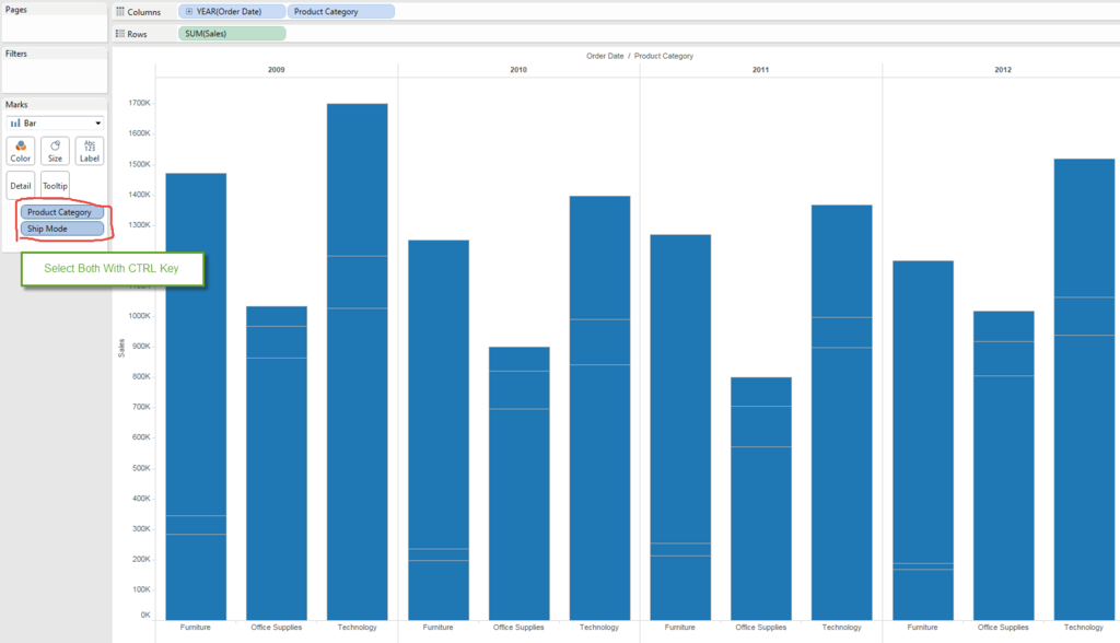
We can drag two dimensions at same time into color shelf.
With that, Tableau automatically select appropriate color setting for all combination of colors.
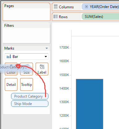

Done !
This is very easy and simple, however, there are some problems.
- Color legend shows 9 colors which is busy.
- When you try to change color feature, you need to change all 9 colors respectively.
- We lose the color we use for existing category. (<== Thsi is the bad side effect.)
For examle, I have different color set for "Product Category", but this work overwrite whole color settings.
So, I will show different method to achieve same result.
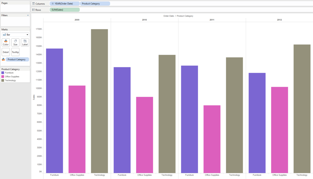
Let's start from simple VIZ like below.
I cahnged color set of "Product Category" intentionally.

We already have "Sales" field in the row shelf, but add one more "Sales" field into secondary axis.
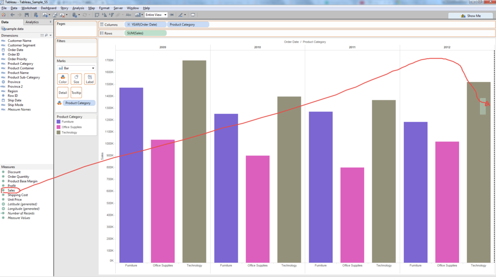
Don't forget "Synclonize"

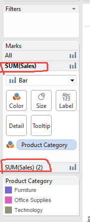
We can see two Bar charts settings.
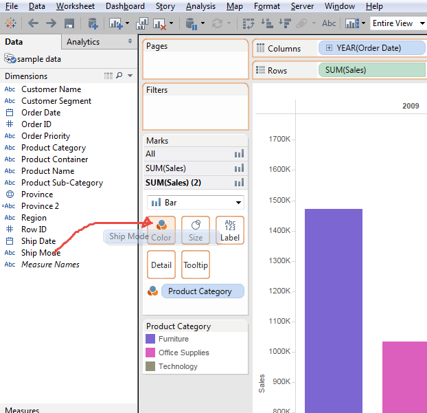
Add "Ship Mode" into secondary axis's Color shelf.
Got below VIZ.
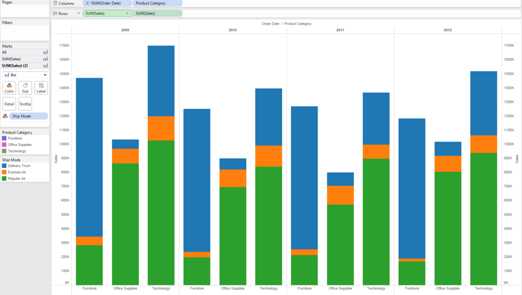
New Color on secondary axis overwrote exisitng primary axis's color.
Select "Edit Colors" on sencondary Axis Bar chart.
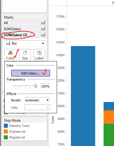
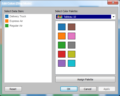
Gray 5 might be appropriate.
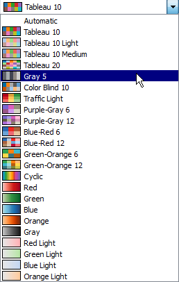
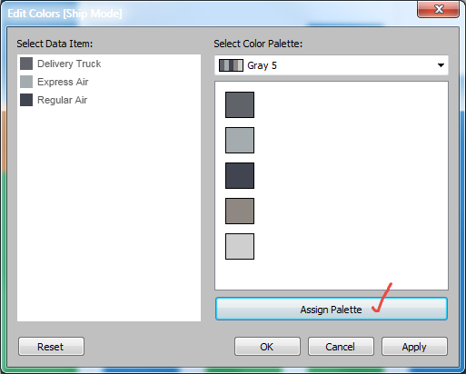
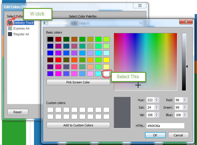
This the light ==> dark order is not appropriate, so we manually change "Delivery Truck" color.

Then on secondary bar cahrt's color shelf, we change the transparency.
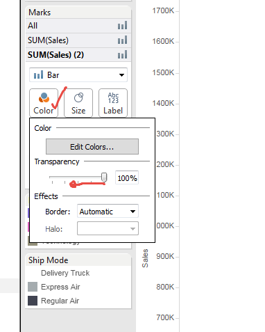
25%'s case is as example, but you can choose the rate as you like.
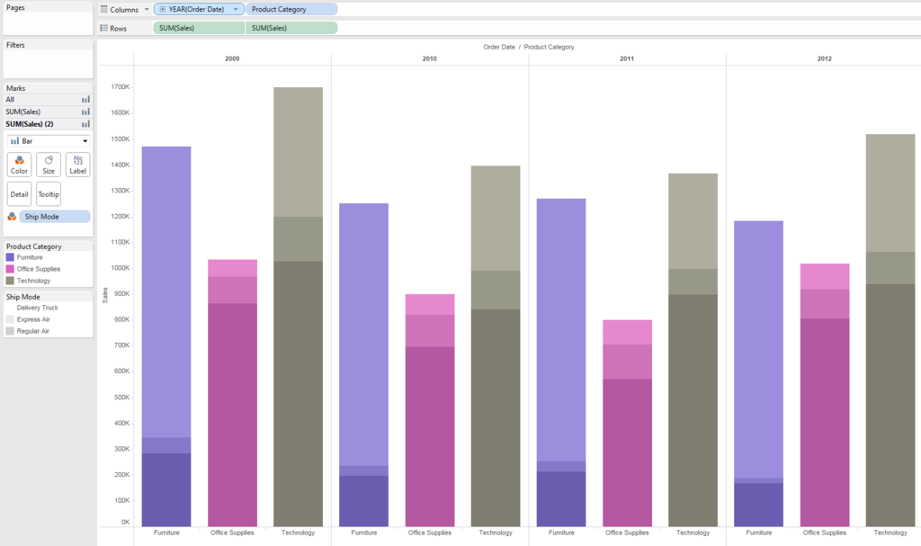
Hide secondary axis's header.

And add label.
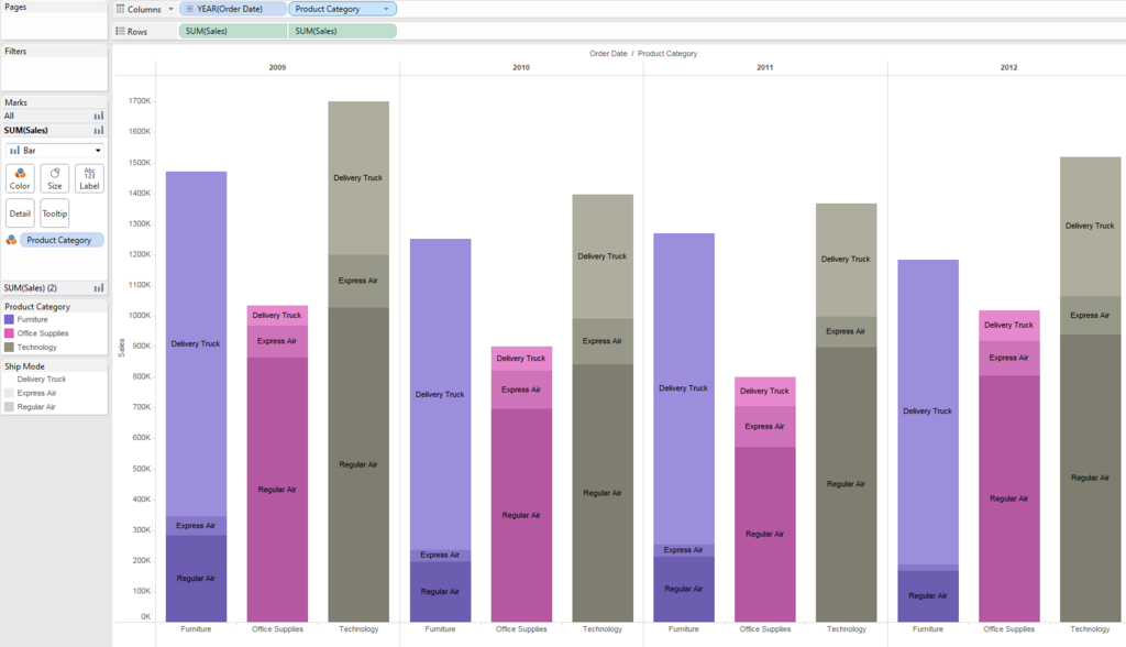
We could show "Ship Mode" category by thickness of color with keeping customized "Priduct Category" color.

OK, let's Play around and Enjoy!