This not what I want : Dual Axis Graph's synchronization
I have not updated several days, let's start.
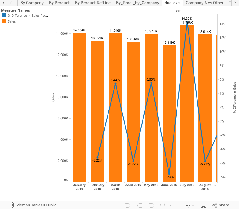
We want to draw dual axis chart with abar and Graph.
It's not difficult at all, but couple of TIPS.
Starting from this graph.

We want to show the delta percentage from last month.
We use table aclculationi, it's easy enough.

You drag the table calclation Pill in Rows, then the below graph is available, but not good enough.
We want to show it as line chart.

You can see dotted line when you drag "Difference percentage" pill to right-end of bar chart, which means you can use this field as 2ndary axis.


It's overwrapped, but bar graph is not good to see.
let's change the type to Line from Bar.


It's done, but somethign is not good.
The reason is Bar chart's main Y-axis include negative numbers.
Only Line chart should have negative number, in this case.
You can change Mian Y-Axis "mimium" as "Zero", but that methos is not "Elegant" at all.
Here is an "Elegant" solution.

On 2nd axis, un-check "Include zero".

Then ,

really done.
We still need to modify lavel . with CTRL, drag "Difference percentage" pill to Line chart's label.


Some lable is overwrapped, but ignorable as long as you show this through Tableau.
If you need to copy paste to PowerPoint, minor making up will be needed, though.
ON more final causion:
If you use Main axis to "exclude zero", the graph lokk like below.

It seems working, but this graph is not at all correct
Becasue bar graph does not include zero, it starts from 12800,
This is the first thing we need avoid when we create bar cahrt, please pay attention.
K, Let's play aroudn and Enjoy!